

EllieKini/Herta
Audio-to-Audio
•
Updated
text
stringlengths 0
2k
| heading1
stringlengths 4
79
| source_page_url
stringclasses 183
values | source_page_title
stringclasses 183
values |
|---|---|---|---|
If you already have a recent version of `gradio`, then the `gradio_client` is
included as a dependency. But note that this documentation reflects the latest
version of the `gradio_client`, so upgrade if you’re not sure!
The lightweight `gradio_client` package can be installed from pip (or pip3)
and is tested to work with **Python versions 3.9 or higher** :
$ pip install --upgrade gradio_client
|
Installation
|
https://gradio.app/docs/python-client/introduction
|
Python Client - Introduction Docs
|
Spaces
Start by connecting instantiating a `Client` object and connecting it to a
Gradio app that is running on Hugging Face Spaces.
from gradio_client import Client
client = Client("abidlabs/en2fr") a Space that translates from English to French
You can also connect to private Spaces by passing in your HF token with the
`hf_token` parameter. You can get your HF token here:
<https://huggingface.co/settings/tokens>
from gradio_client import Client
client = Client("abidlabs/my-private-space", hf_token="...")
|
Connecting to a Gradio App on Hugging Face
|
https://gradio.app/docs/python-client/introduction
|
Python Client - Introduction Docs
|
use
While you can use any public Space as an API, you may get rate limited by
Hugging Face if you make too many requests. For unlimited usage of a Space,
simply duplicate the Space to create a private Space, and then use it to make
as many requests as you’d like!
The `gradio_client` includes a class method: `Client.duplicate()` to make this
process simple (you’ll need to pass in your [Hugging Face
token](https://huggingface.co/settings/tokens) or be logged in using the
Hugging Face CLI):
import os
from gradio_client import Client, file
HF_TOKEN = os.environ.get("HF_TOKEN")
client = Client.duplicate("abidlabs/whisper", hf_token=HF_TOKEN)
client.predict(file("audio_sample.wav"))
>> "This is a test of the whisper speech recognition model."
If you have previously duplicated a Space, re-running `duplicate()` will _not_
create a new Space. Instead, the Client will attach to the previously-created
Space. So it is safe to re-run the `Client.duplicate()` method multiple times.
**Note:** if the original Space uses GPUs, your private Space will as well,
and your Hugging Face account will get billed based on the price of the GPU.
To minimize charges, your Space will automatically go to sleep after 1 hour of
inactivity. You can also set the hardware using the `hardware` parameter of
`duplicate()`.
|
Duplicating a Space for private
|
https://gradio.app/docs/python-client/introduction
|
Python Client - Introduction Docs
|
app
If your app is running somewhere else, just provide the full URL instead,
including the “http://” or “https://“. Here’s an example of making predictions
to a Gradio app that is running on a share URL:
from gradio_client import Client
client = Client("https://bec81a83-5b5c-471e.gradio.live")
|
Connecting a general Gradio
|
https://gradio.app/docs/python-client/introduction
|
Python Client - Introduction Docs
|
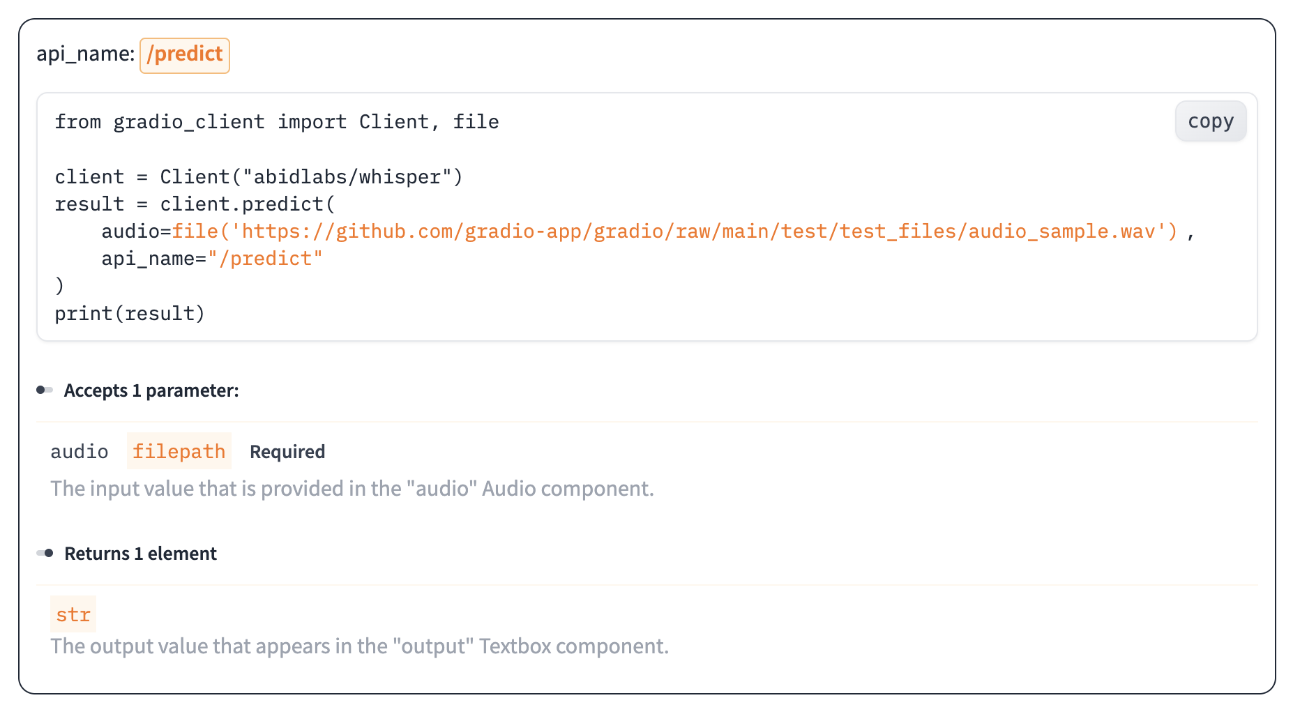
Once you have connected to a Gradio app, you can view the APIs that are
available to you by calling the `Client.view_api()` method. For the Whisper
Space, we see the following:
Client.predict() Usage Info
---------------------------
Named API endpoints: 1
- predict(audio, api_name="/predict") -> output
Parameters:
- [Audio] audio: filepath (required)
Returns:
- [Textbox] output: str
We see that we have 1 API endpoint in this space, and shows us how to use the
API endpoint to make a prediction: we should call the `.predict()` method
(which we will explore below), providing a parameter `input_audio` of type
`str`, which is a `filepath or URL`.
We should also provide the `api_name='/predict'` argument to the `predict()`
method. Although this isn’t necessary if a Gradio app has only 1 named
endpoint, it does allow us to call different endpoints in a single app if they
are available.
|
Inspecting the API endpoints
|
https://gradio.app/docs/python-client/introduction
|
Python Client - Introduction Docs
|
As an alternative to running the `.view_api()` method, you can click on the
“Use via API” link in the footer of the Gradio app, which shows us the same
information, along with example usage.
The View API page also includes an “API Recorder” that lets you interact with
the Gradio UI normally and converts your interactions into the corresponding
code to run with the Python Client.
|
The “View API” Page
|
https://gradio.app/docs/python-client/introduction
|
Python Client - Introduction Docs
|
The simplest way to make a prediction is simply to call the `.predict()`
function with the appropriate arguments:
from gradio_client import Client
client = Client("abidlabs/en2fr", api_name='/predict')
client.predict("Hello")
>> Bonjour
If there are multiple parameters, then you should pass them as separate
arguments to `.predict()`, like this:
from gradio_client import Client
client = Client("gradio/calculator")
client.predict(4, "add", 5)
>> 9.0
It is recommended to provide key-word arguments instead of positional
arguments:
from gradio_client import Client
client = Client("gradio/calculator")
client.predict(num1=4, operation="add", num2=5)
>> 9.0
This allows you to take advantage of default arguments. For example, this
Space includes the default value for the Slider component so you do not need
to provide it when accessing it with the client.
from gradio_client import Client
client = Client("abidlabs/image_generator")
client.predict(text="an astronaut riding a camel")
The default value is the initial value of the corresponding Gradio component.
If the component does not have an initial value, but if the corresponding
argument in the predict function has a default value of `None`, then that
parameter is also optional in the client. Of course, if you’d like to override
it, you can include it as well:
from gradio_client import Client
client = Client("abidlabs/image_generator")
client.predict(text="an astronaut riding a camel", steps=25)
For providing files or URLs as inputs, you should pass in the filepath or URL
to the file enclosed within `gradio_client.file()`. This takes care of
uploading the file to the Gradio server and ensures that the file is
preprocessed correctly:
from gradio_client import Client, file
client = Client("abidlabs/whisper")
client.predict(
|
Making a prediction
|
https://gradio.app/docs/python-client/introduction
|
Python Client - Introduction Docs
|
to the Gradio server and ensures that the file is
preprocessed correctly:
from gradio_client import Client, file
client = Client("abidlabs/whisper")
client.predict(
audio=file("https://audio-samples.github.io/samples/mp3/blizzard_unconditional/sample-0.mp3")
)
>> "My thought I have nobody by a beauty and will as you poured. Mr. Rochester is serve in that so don't find simpus, and devoted abode, to at might in a r—"
|
Making a prediction
|
https://gradio.app/docs/python-client/introduction
|
Python Client - Introduction Docs
|
Oe should note that `.predict()` is a _blocking_ operation as it waits for the
operation to complete before returning the prediction.
In many cases, you may be better off letting the job run in the background
until you need the results of the prediction. You can do this by creating a
`Job` instance using the `.submit()` method, and then later calling
`.result()` on the job to get the result. For example:
from gradio_client import Client
client = Client(space="abidlabs/en2fr")
job = client.submit("Hello", api_name="/predict") This is not blocking
Do something else
job.result() This is blocking
>> Bonjour
|
Running jobs asynchronously
|
https://gradio.app/docs/python-client/introduction
|
Python Client - Introduction Docs
|
Alternatively, one can add one or more callbacks to perform actions after the
job has completed running, like this:
from gradio_client import Client
def print_result(x):
print("The translated result is: {x}")
client = Client(space="abidlabs/en2fr")
job = client.submit("Hello", api_name="/predict", result_callbacks=[print_result])
Do something else
>> The translated result is: Bonjour
|
Adding callbacks
|
https://gradio.app/docs/python-client/introduction
|
Python Client - Introduction Docs
|
The `Job` object also allows you to get the status of the running job by
calling the `.status()` method. This returns a `StatusUpdate` object with the
following attributes: `code` (the status code, one of a set of defined strings
representing the status. See the `utils.Status` class), `rank` (the current
position of this job in the queue), `queue_size` (the total queue size), `eta`
(estimated time this job will complete), `success` (a boolean representing
whether the job completed successfully), and `time` (the time that the status
was generated).
from gradio_client import Client
client = Client(src="gradio/calculator")
job = client.submit(5, "add", 4, api_name="/predict")
job.status()
>> <Status.STARTING: 'STARTING'>
_Note_ : The `Job` class also has a `.done()` instance method which returns a
boolean indicating whether the job has completed.
|
Status
|
https://gradio.app/docs/python-client/introduction
|
Python Client - Introduction Docs
|
The `Job` class also has a `.cancel()` instance method that cancels jobs that
have been queued but not started. For example, if you run:
client = Client("abidlabs/whisper")
job1 = client.submit(file("audio_sample1.wav"))
job2 = client.submit(file("audio_sample2.wav"))
job1.cancel() will return False, assuming the job has started
job2.cancel() will return True, indicating that the job has been canceled
If the first job has started processing, then it will not be canceled. If the
second job has not yet started, it will be successfully canceled and removed
from the queue.
|
Cancelling Jobs
|
https://gradio.app/docs/python-client/introduction
|
Python Client - Introduction Docs
|
Some Gradio API endpoints do not return a single value, rather they return a
series of values. You can get the series of values that have been returned at
any time from such a generator endpoint by running `job.outputs()`:
from gradio_client import Client
client = Client(src="gradio/count_generator")
job = client.submit(3, api_name="/count")
while not job.done():
time.sleep(0.1)
job.outputs()
>> ['0', '1', '2']
Note that running `job.result()` on a generator endpoint only gives you the
_first_ value returned by the endpoint.
The `Job` object is also iterable, which means you can use it to display the
results of a generator function as they are returned from the endpoint. Here’s
the equivalent example using the `Job` as a generator:
from gradio_client import Client
client = Client(src="gradio/count_generator")
job = client.submit(3, api_name="/count")
for o in job:
print(o)
>> 0
>> 1
>> 2
You can also cancel jobs that that have iterative outputs, in which case the
job will finish as soon as the current iteration finishes running.
from gradio_client import Client
import time
client = Client("abidlabs/test-yield")
job = client.submit("abcdef")
time.sleep(3)
job.cancel() job cancels after 2 iterations
|
Generator Endpoints
|
https://gradio.app/docs/python-client/introduction
|
Python Client - Introduction Docs
|
Gradio demos can include [session state](https://www.gradio.app/guides/state-
in-blocks), which provides a way for demos to persist information from user
interactions within a page session.
For example, consider the following demo, which maintains a list of words that
a user has submitted in a `gr.State` component. When a user submits a new
word, it is added to the state, and the number of previous occurrences of that
word is displayed:
import gradio as gr
def count(word, list_of_words):
return list_of_words.count(word), list_of_words + [word]
with gr.Blocks() as demo:
words = gr.State([])
textbox = gr.Textbox()
number = gr.Number()
textbox.submit(count, inputs=[textbox, words], outputs=[number, words])
demo.launch()
If you were to connect this this Gradio app using the Python Client, you would
notice that the API information only shows a single input and output:
Client.predict() Usage Info
---------------------------
Named API endpoints: 1
- predict(word, api_name="/count") -> value_31
Parameters:
- [Textbox] word: str (required)
Returns:
- [Number] value_31: float
That is because the Python client handles state automatically for you — as you
make a series of requests, the returned state from one request is stored
internally and automatically supplied for the subsequent request. If you’d
like to reset the state, you can do that by calling `Client.reset_session()`.
|
Demos with Session State
|
https://gradio.app/docs/python-client/introduction
|
Python Client - Introduction Docs
|
The main Client class for the Python client. This class is used to connect
to a remote Gradio app and call its API endpoints.
|
Description
|
https://gradio.app/docs/python-client/client
|
Python Client - Client Docs
|
from gradio_client import Client
client = Client("abidlabs/whisper-large-v2") connecting to a Hugging Face Space
client.predict("test.mp4", api_name="/predict")
>> What a nice recording! returns the result of the remote API call
client = Client("https://bec81a83-5b5c-471e.gradio.live") connecting to a temporary Gradio share URL
job = client.submit("hello", api_name="/predict") runs the prediction in a background thread
job.result()
>> 49 returns the result of the remote API call (blocking call)
|
Example usage
|
https://gradio.app/docs/python-client/client
|
Python Client - Client Docs
|
Parameters ▼
src: str
either the name of the Hugging Face Space to load, (e.g. "abidlabs/whisper-
large-v2") or the full URL (including "http" or "https") of the hosted Gradio
app to load (e.g. "http://mydomain.com/app" or
"https://bec81a83-5b5c-471e.gradio.live/").
token: str | None
default `= None`
optional Hugging Face token to use to access private Spaces. By default, the
locally saved token is used if there is one. Find your tokens here:
https://huggingface.co/settings/tokens.
max_workers: int
default `= 40`
maximum number of thread workers that can be used to make requests to the
remote Gradio app simultaneously.
verbose: bool
default `= True`
whether the client should print statements to the console.
auth: tuple[str, str] | None
default `= None`
httpx_kwargs: dict[str, Any] | None
default `= None`
additional keyword arguments to pass to `httpx.Client`, `httpx.stream`,
`httpx.get` and `httpx.post`. This can be used to set timeouts, proxies, http
auth, etc.
headers: dict[str, str] | None
default `= None`
additional headers to send to the remote Gradio app on every request. By
default only the HF authorization and user-agent headers are sent. This
parameter will override the default headers if they have the same keys.
download_files: str | Path | Literal[False]
default `= "/tmp/gradio"`
directory where the client should download output files on the local machine
from the remote API. By default, uses the value of the GRADIO_TEMP_DIR
environment variable which, if not set by the user, is a temporary directory
on your machine. If False, the client does not download files and returns a
FileData dataclass object with the filepath on the remote machine instead.
ssl_verify: bool
default `= True`
if False, skips certificate validation which allows the client to connect to
Gradio apps that are using self-signed ce
|
Initialization
|
https://gradio.app/docs/python-client/client
|
Python Client - Client Docs
|
n the remote machine instead.
ssl_verify: bool
default `= True`
if False, skips certificate validation which allows the client to connect to
Gradio apps that are using self-signed certificates.
analytics_enabled: bool
default `= True`
Whether to allow basic telemetry. If None, will use GRADIO_ANALYTICS_ENABLED
environment variable or default to True.
|
Initialization
|
https://gradio.app/docs/python-client/client
|
Python Client - Client Docs
|
Description
Event listeners allow you to respond to user interactions with the UI
components you've defined in a Gradio Blocks app. When a user interacts with
an element, such as changing a slider value or uploading an image, a function
is called.
Supported Event Listeners
The Client component supports the following event listeners. Each event
listener takes the same parameters, which are listed in the Event Parameters
table below.
Listener| Description
---|---
`Client.predict(fn, ···)`| Calls the Gradio API and returns the result (this
is a blocking call). Arguments can be provided as positional arguments or as
keyword arguments (latter is recommended). <br>
`Client.submit(fn, ···)`| Creates and returns a Job object which calls the
Gradio API in a background thread. The job can be used to retrieve the status
and result of the remote API call. Arguments can be provided as positional
arguments or as keyword arguments (latter is recommended). <br>
`Client.view_api(fn, ···)`| Prints the usage info for the API. If the Gradio
app has multiple API endpoints, the usage info for each endpoint will be
printed separately. If return_format="dict" the info is returned in dictionary
format, as shown in the example below. <br>
`Client.duplicate(fn, ···)`| Duplicates a Hugging Face Space under your
account and returns a Client object for the new Space. No duplication is
created if the Space already exists in your account (to override this, provide
a new name for the new Space using `to_id`). To use this method, you must
provide an `token` or be logged in via the Hugging Face Hub CLI. <br> The new
Space will be private by default and use the same hardware as the original
Space. This can be changed by using the `private` and `hardware` parameters.
For hardware upgrades (beyond the basic CPU tier), you may be required to
provide billing information on Hugging Face:
<https://huggingface.co/settings/billing> <br>
Event Parameters
Parameters ▼
|
Event Listeners
|
https://gradio.app/docs/python-client/client
|
Python Client - Client Docs
|
grades (beyond the basic CPU tier), you may be required to
provide billing information on Hugging Face:
<https://huggingface.co/settings/billing> <br>
Event Parameters
Parameters ▼
args: <class 'inspect._empty'>
The positional arguments to pass to the remote API endpoint. The order of the
arguments must match the order of the inputs in the Gradio app.
api_name: str | None
default `= None`
The name of the API endpoint to call starting with a leading slash, e.g.
"/predict". Does not need to be provided if the Gradio app has only one named
API endpoint.
fn_index: int | None
default `= None`
As an alternative to api_name, this parameter takes the index of the API
endpoint to call, e.g. 0. Both api_name and fn_index can be provided, but if
they conflict, api_name will take precedence.
headers: dict[str, str] | None
default `= None`
Additional headers to send to the remote Gradio app on this request. This
parameter will overrides the headers provided in the Client constructor if
they have the same keys.
kwargs: <class 'inspect._empty'>
The keyword arguments to pass to the remote API endpoint.
|
Event Listeners
|
https://gradio.app/docs/python-client/client
|
Python Client - Client Docs
|
A Job is a wrapper over the Future class that represents a prediction call
that has been submitted by the Gradio client. This class is not meant to be
instantiated directly, but rather is created by the Client.submit() method.
A Job object includes methods to get the status of the prediction call, as
well to get the outputs of the prediction call. Job objects are also iterable,
and can be used in a loop to get the outputs of prediction calls as they
become available for generator endpoints.
|
Description
|
https://gradio.app/docs/python-client/job
|
Python Client - Job Docs
|
Parameters ▼
future: Future
The future object that represents the prediction call, created by the
Client.submit() method
communicator: Communicator | None
default `= None`
The communicator object that is used to communicate between the client and the
background thread running the job
verbose: bool
default `= True`
Whether to print any status-related messages to the console
space_id: str | None
default `= None`
The space ID corresponding to the Client object that created this Job object
|
Initialization
|
https://gradio.app/docs/python-client/job
|
Python Client - Job Docs
|
Description
Event listeners allow you to respond to user interactions with the UI
components you've defined in a Gradio Blocks app. When a user interacts with
an element, such as changing a slider value or uploading an image, a function
is called.
Supported Event Listeners
The Job component supports the following event listeners. Each event listener
takes the same parameters, which are listed in the Event Parameters table
below.
Listener| Description
---|---
`Job.result(fn, ···)`| Return the result of the call that the future
represents. Raises CancelledError: If the future was cancelled, TimeoutError:
If the future didn't finish executing before the given timeout, and Exception:
If the call raised then that exception will be raised. <br>
`Job.outputs(fn, ···)`| Returns a list containing the latest outputs from the
Job. <br> If the endpoint has multiple output components, the list will
contain a tuple of results. Otherwise, it will contain the results without
storing them in tuples. <br> For endpoints that are queued, this list will
contain the final job output even if that endpoint does not use a generator
function. <br>
`Job.status(fn, ···)`| Returns the latest status update from the Job in the
form of a StatusUpdate object, which contains the following fields: code,
rank, queue_size, success, time, eta, and progress_data. <br> progress_data is
a list of updates emitted by the gr.Progress() tracker of the event handler.
Each element of the list has the following fields: index, length, unit,
progress, desc. If the event handler does not have a gr.Progress() tracker,
the progress_data field will be None. <br>
Event Parameters
Parameters ▼
timeout: float | None
default `= None`
The number of seconds to wait for the result if the future isn't done. If
None, then there is no limit on the wait time.
|
Event Listeners
|
https://gradio.app/docs/python-client/job
|
Python Client - Job Docs
|
**Stream From a Gradio app in 5 lines**
Use the `submit` method to get a job you can iterate over.
In python:
from gradio_client import Client
client = Client("gradio/llm_stream")
for result in client.submit("What's the best UI framework in Python?"):
print(result)
In typescript:
import { Client } from "@gradio/client";
const client = await Client.connect("gradio/llm_stream")
const job = client.submit("/predict", {"text": "What's the best UI framework in Python?"})
for await (const msg of job) console.log(msg.data)
**Use the same keyword arguments as the app**
In the examples below, the upstream app has a function with parameters called
`message`, `system_prompt`, and `tokens`. We can see that the client `predict`
call uses the same arguments.
In python:
from gradio_client import Client
client = Client("http://127.0.0.1:7860/")
result = client.predict(
message="Hello!!",
system_prompt="You are helpful AI.",
tokens=10,
api_name="/chat"
)
print(result)
In typescript:
import { Client } from "@gradio/client";
const client = await Client.connect("http://127.0.0.1:7860/");
const result = await client.predict("/chat", {
message: "Hello!!",
system_prompt: "Hello!!",
tokens: 10,
});
console.log(result.data);
**Better Error Messages**
If something goes wrong in the upstream app, the client will raise the same
exception as the app provided that `show_error=True` in the original app's
`launch()` function, or it's a `gr.Error` exception.
|
Ergonomic API 💆
|
https://gradio.app/docs/python-client/version-1-release
|
Python Client - Version 1 Release Docs
|
Anything you can do in the UI, you can do with the client:
* 🔐Authentication
* 🛑 Job Cancelling
* ℹ️ Access Queue Position and API
* 📕 View the API information
Here's an example showing how to display the queue position of a pending job:
from gradio_client import Client
client = Client("gradio/diffusion_model")
job = client.submit("A cute cat")
while not job.done():
status = job.status()
print(f"Current in position {status.rank} out of {status.queue_size}")
|
Transparent Design 🪟
|
https://gradio.app/docs/python-client/version-1-release
|
Python Client - Version 1 Release Docs
|
The client can run from pretty much any python and javascript environment
(node, deno, the browser, Service Workers).
Here's an example using the client from a Flask server using gevent:
from gevent import monkey
monkey.patch_all()
from gradio_client import Client
from flask import Flask, send_file
import time
app = Flask(__name__)
imageclient = Client("gradio/diffusion_model")
@app.route("/gen")
def gen():
result = imageclient.predict(
"A cute cat",
api_name="/predict"
)
return send_file(result)
if __name__ == "__main__":
app.run(host="0.0.0.0", port=5000)
|
Portable Design ⛺️
|
https://gradio.app/docs/python-client/version-1-release
|
Python Client - Version 1 Release Docs
|
Changes
**Python**
* The `serialize` argument of the `Client` class was removed and has no effect.
* The `upload_files` argument of the `Client` was removed.
* All filepaths must be wrapped in the `handle_file` method. For example, `caption = client.predict(handle_file('./dog.jpg'))`.
* The `output_dir` argument was removed. It is not specified in the `download_files` argument.
**Javascript**
The client has been redesigned entirely. It was refactored from a function
into a class. An instance can now be constructed by awaiting the `connect`
method.
const app = await Client.connect("gradio/whisper")
The app variable has the same methods as the python class (`submit`,
`predict`, `view_api`, `duplicate`).
|
v1.0 Migration Guide and Breaking
|
https://gradio.app/docs/python-client/version-1-release
|
Python Client - Version 1 Release Docs
|
ZeroGPU
ZeroGPU spaces are rate-limited to ensure that a single user does not hog all
of the available GPUs. The limit is controlled by a special token that the
Hugging Face Hub infrastructure adds to all incoming requests to Spaces. This
token is a request header called `X-IP-Token` and its value changes depending
on the user who makes a request to the ZeroGPU space.
Let’s say you want to create a space (Space A) that uses a ZeroGPU space
(Space B) programmatically. Normally, calling Space B from Space A with the
Gradio Python client would quickly exhaust Space B’s rate limit, as all the
requests to the ZeroGPU space would be missing the `X-IP-Token` request header
and would therefore be treated as unauthenticated.
In order to avoid this, we need to extract the `X-IP-Token` of the user using
Space A before we call Space B programmatically. Where possible, specifically
in the case of functions that are passed into event listeners directly, Gradio
automatically extracts the `X-IP-Token` from the incoming request and passes
it into the Gradio Client. But if the Client is instantiated outside of such a
function, then you may need to pass in the token manually.
How to do this will be explained in the following section.
|
Explaining Rate Limits for
|
https://gradio.app/docs/python-client/using-zero-gpu-spaces
|
Python Client - Using Zero Gpu Spaces Docs
|
Token
In the following hypothetical example, when a user presses enter in the
textbox, the `generate()` function is called, which calls a second function,
`text_to_image()`. Because the Gradio Client is being instantiated indirectly,
in `text_to_image()`, we will need to extract their token from the `X-IP-
Token` header of the incoming request. We will use this header when
constructing the gradio client.
import gradio as gr
from gradio_client import Client
def text_to_image(prompt, request: gr.Request):
x_ip_token = request.headers['x-ip-token']
client = Client("hysts/SDXL", headers={"x-ip-token": x_ip_token})
img = client.predict(prompt, api_name="/predict")
return img
def generate(prompt, request: gr.Request):
prompt = prompt[:300]
return text_to_image(prompt, request)
with gr.Blocks() as demo:
image = gr.Image()
prompt = gr.Textbox(max_lines=1)
prompt.submit(generate, [prompt], [image])
demo.launch()
|
Avoiding Rate Limits by Manually Passing an IP
|
https://gradio.app/docs/python-client/using-zero-gpu-spaces
|
Python Client - Using Zero Gpu Spaces Docs
|
`gradio-rs` is a Gradio Client in Rust built by
[@JacobLinCool](https://github.com/JacobLinCool). You can find the repo
[here](https://github.com/JacobLinCool/gradio-rs), and more in depth API
documentation [here](https://docs.rs/gradio/latest/gradio/).
|
Introduction
|
https://gradio.app/docs/third-party-clients/rust-client
|
Third Party Clients - Rust Client Docs
|
Here is an example of using BS-RoFormer model to separate vocals and
background music from an audio file.
use gradio::{PredictionInput, Client, ClientOptions};
[tokio::main]
async fn main() {
if std::env::args().len() < 2 {
println!("Please provide an audio file path as an argument");
std::process::exit(1);
}
let args: Vec<String> = std::env::args().collect();
let file_path = &args[1];
println!("File: {}", file_path);
let client = Client::new("JacobLinCool/vocal-separation", ClientOptions::default())
.await
.unwrap();
let output = client
.predict(
"/separate",
vec![
PredictionInput::from_file(file_path),
PredictionInput::from_value("BS-RoFormer"),
],
)
.await
.unwrap();
println!(
"Vocals: {}",
output[0].clone().as_file().unwrap().url.unwrap()
);
println!(
"Background: {}",
output[1].clone().as_file().unwrap().url.unwrap()
);
}
You can find more examples [here](https://github.com/JacobLinCool/gradio-
rs/tree/main/examples).
|
Usage
|
https://gradio.app/docs/third-party-clients/rust-client
|
Third Party Clients - Rust Client Docs
|
cargo install gradio
gr --help
Take [stabilityai/stable-
diffusion-3-medium](https://huggingface.co/spaces/stabilityai/stable-
diffusion-3-medium) HF Space as an example:
> gr list stabilityai/stable-diffusion-3-medium
API Spec for stabilityai/stable-diffusion-3-medium:
/infer
Parameters:
prompt ( str )
negative_prompt ( str )
seed ( float ) numeric value between 0 and 2147483647
randomize_seed ( bool )
width ( float ) numeric value between 256 and 1344
height ( float ) numeric value between 256 and 1344
guidance_scale ( float ) numeric value between 0.0 and 10.0
num_inference_steps ( float ) numeric value between 1 and 50
Returns:
Result ( filepath )
Seed ( float ) numeric value between 0 and 2147483647
> gr run stabilityai/stable-diffusion-3-medium infer 'Rusty text "AI & CLI" on the snow.' '' 0 true 1024 1024 5 28
Result: https://stabilityai-stable-diffusion-3-medium.hf.space/file=/tmp/gradio/5735ca7775e05f8d56d929d8f57b099a675c0a01/image.webp
Seed: 486085626
For file input, simply use the file path as the argument:
gr run hf-audio/whisper-large-v3 predict 'test-audio.wav' 'transcribe'
output: " Did you know you can try the coolest model on your command line?"
|
Command Line Interface
|
https://gradio.app/docs/third-party-clients/rust-client
|
Third Party Clients - Rust Client Docs
|
Gradio applications support programmatic requests from many environments:
* The [Python Client](/docs/python-client): `gradio-client` allows you to make requests from Python environments.
* The [JavaScript Client](/docs/js-client): `@gradio/client` allows you to make requests in TypeScript from the browser or server-side.
* You can also query gradio apps [directly from cURL](/guides/querying-gradio-apps-with-curl).
|
Gradio Clients
|
https://gradio.app/docs/third-party-clients/introduction
|
Third Party Clients - Introduction Docs
|
We also encourage the development and use of third party clients built by
the community:
* [Rust Client](/docs/third-party-clients/rust-client): `gradio-rs` built by [@JacobLinCool](https://github.com/JacobLinCool) allows you to make requests in Rust.
* [Powershell Client](https://github.com/rrg92/powershai): `powershai` built by [@rrg92](https://github.com/rrg92) allows you to make requests to Gradio apps directly from Powershell. See [here for documentation](https://github.com/rrg92/powershai/blob/main/docs/en-US/providers/HUGGING-FACE.md)
|
Community Clients
|
https://gradio.app/docs/third-party-clients/introduction
|
Third Party Clients - Introduction Docs
|
Creates a set of (string or numeric type) radio buttons of which only one
can be selected.
|
Description
|
https://gradio.app/docs/gradio/radio
|
Gradio - Radio Docs
|
**As input component** : Passes the value of the selected radio button as a `str | int | float`, or its index as an `int` into the function, depending on `type`.
Your function should accept one of these types:
def predict(
value: str | int | float | None
)
...
**As output component** : Expects a `str | int | float` corresponding to the value of the radio button to be selected
Your function should return one of these types:
def predict(···) -> str | int | float | None
...
return value
|
Behavior
|
https://gradio.app/docs/gradio/radio
|
Gradio - Radio Docs
|
Parameters ▼
choices: list[str | int | float | tuple[str, str | int | float]] | None
default `= None`
A list of string or numeric options to select from. An option can also be a
tuple of the form (name, value), where name is the displayed name of the radio
button and value is the value to be passed to the function, or returned by the
function.
value: str | int | float | Callable | None
default `= None`
The option selected by default. If None, no option is selected by default. If
a function is provided, the function will be called each time the app loads to
set the initial value of this component.
type: Literal['value', 'index']
default `= "value"`
Type of value to be returned by component. "value" returns the string of the
choice selected, "index" returns the index of the choice selected.
label: str | I18nData | None
default `= None`
the label for this component, displayed above the component if `show_label` is
`True` and is also used as the header if there are a table of examples for
this component. If None and used in a `gr.Interface`, the label will be the
name of the parameter this component corresponds to.
info: str | I18nData | None
default `= None`
additional component description, appears below the label in smaller font.
Supports markdown / HTML syntax.
every: Timer | float | None
default `= None`
Continously calls `value` to recalculate it if `value` is a function (has no
effect otherwise). Can provide a Timer whose tick resets `value`, or a float
that provides the regular interval for the reset Timer.
inputs: Component | list[Component] | set[Component] | None
default `= None`
Components that are used as inputs to calculate `value` if `value` is a
function (has no effect otherwise). `value` is recalculated any time the
inputs change.
show_label: bool | None
default `= None`
if True, will display label.
|
Initialization
|
https://gradio.app/docs/gradio/radio
|
Gradio - Radio Docs
|
value` is a
function (has no effect otherwise). `value` is recalculated any time the
inputs change.
show_label: bool | None
default `= None`
if True, will display label.
container: bool
default `= True`
If True, will place the component in a container - providing some extra
padding around the border.
scale: int | None
default `= None`
Relative width compared to adjacent Components in a Row. For example, if
Component A has scale=2, and Component B has scale=1, A will be twice as wide
as B. Should be an integer.
min_width: int
default `= 160`
Minimum pixel width, will wrap if not sufficient screen space to satisfy this
value. If a certain scale value results in this Component being narrower than
min_width, the min_width parameter will be respected first.
interactive: bool | None
default `= None`
If True, choices in this radio group will be selectable; if False, selection
will be disabled. If not provided, this is inferred based on whether the
component is used as an input or output.
visible: bool | Literal['hidden']
default `= True`
If False, component will be hidden. If "hidden", component will be visually
hidden and not take up space in the layout but still exist in the DOM
elem_id: str | None
default `= None`
An optional string that is assigned as the id of this component in the HTML
DOM. Can be used for targeting CSS styles.
elem_classes: list[str] | str | None
default `= None`
An optional list of strings that are assigned as the classes of this component
in the HTML DOM. Can be used for targeting CSS styles.
render: bool
default `= True`
If False, component will not render be rendered in the Blocks context. Should
be used if the intention is to assign event listeners now but render the
component later.
key: int | str | tuple[int | str, ...] | None
default `= None`
in a gr.render, Compon
|
Initialization
|
https://gradio.app/docs/gradio/radio
|
Gradio - Radio Docs
|
Should
be used if the intention is to assign event listeners now but render the
component later.
key: int | str | tuple[int | str, ...] | None
default `= None`
in a gr.render, Components with the same key across re-renders are treated as
the same component, not a new component. Properties set in 'preserved_by_key'
are not reset across a re-render.
preserved_by_key: list[str] | str | None
default `= "value"`
A list of parameters from this component's constructor. Inside a gr.render()
function, if a component is re-rendered with the same key, these (and only
these) parameters will be preserved in the UI (if they have been changed by
the user or an event listener) instead of re-rendered based on the values
provided during constructor.
rtl: bool
default `= False`
If True, the radio buttons will be displayed in right-to-left order. Default
is False.
buttons: list[Button] | None
default `= None`
A list of gr.Button() instances to show in the top right corner of the
component. Custom buttons will appear in the toolbar with their configured
icon and/or label, and clicking them will trigger any .click() events
registered on the button.
|
Initialization
|
https://gradio.app/docs/gradio/radio
|
Gradio - Radio Docs
|
Class| Interface String Shortcut| Initialization
---|---|---
`gradio.Radio`| "radio"| Uses default values
|
Shortcuts
|
https://gradio.app/docs/gradio/radio
|
Gradio - Radio Docs
|
sentence_builderblocks_essay
|
Demos
|
https://gradio.app/docs/gradio/radio
|
Gradio - Radio Docs
|
Description
Event listeners allow you to respond to user interactions with the UI
components you've defined in a Gradio Blocks app. When a user interacts with
an element, such as changing a slider value or uploading an image, a function
is called.
Supported Event Listeners
The Radio component supports the following event listeners. Each event
listener takes the same parameters, which are listed in the Event Parameters
table below.
Listener| Description
---|---
`Radio.select(fn, ···)`| Event listener for when the user selects or deselects
the Radio. Uses event data gradio.SelectData to carry `value` referring to the
label of the Radio, and `selected` to refer to state of the Radio. See
<https://www.gradio.app/main/docs/gradio/eventdata> for more details.
`Radio.change(fn, ···)`| Triggered when the value of the Radio changes either
because of user input (e.g. a user types in a textbox) OR because of a
function update (e.g. an image receives a value from the output of an event
trigger). See `.input()` for a listener that is only triggered by user input.
`Radio.input(fn, ···)`| This listener is triggered when the user changes the
value of the Radio.
Event Parameters
Parameters ▼
fn: Callable | None | Literal['decorator']
default `= "decorator"`
the function to call when this event is triggered. Often a machine learning
model's prediction function. Each parameter of the function corresponds to one
input component, and the function should return a single value or a tuple of
values, with each element in the tuple corresponding to one output component.
inputs: Component | BlockContext | list[Component | BlockContext] | Set[Component | BlockContext] | None
default `= None`
List of gradio.components to use as inputs. If the function takes no inputs,
this should be an empty list.
outputs: Component | BlockContext | list[Component | BlockContext] | Set[Component | BlockContext] | None
default
|
Event Listeners
|
https://gradio.app/docs/gradio/radio
|
Gradio - Radio Docs
|
puts. If the function takes no inputs,
this should be an empty list.
outputs: Component | BlockContext | list[Component | BlockContext] | Set[Component | BlockContext] | None
default `= None`
List of gradio.components to use as outputs. If the function returns no
outputs, this should be an empty list.
api_name: str | None
default `= None`
defines how the endpoint appears in the API docs. Can be a string or None. If
set to a string, the endpoint will be exposed in the API docs with the given
name. If None (default), the name of the function will be used as the API
endpoint.
api_description: str | None | Literal[False]
default `= None`
Description of the API endpoint. Can be a string, None, or False. If set to a
string, the endpoint will be exposed in the API docs with the given
description. If None, the function's docstring will be used as the API
endpoint description. If False, then no description will be displayed in the
API docs.
scroll_to_output: bool
default `= False`
If True, will scroll to output component on completion
show_progress: Literal['full', 'minimal', 'hidden']
default `= "full"`
how to show the progress animation while event is running: "full" shows a
spinner which covers the output component area as well as a runtime display in
the upper right corner, "minimal" only shows the runtime display, "hidden"
shows no progress animation at all
show_progress_on: Component | list[Component] | None
default `= None`
Component or list of components to show the progress animation on. If None,
will show the progress animation on all of the output components.
queue: bool
default `= True`
If True, will place the request on the queue, if the queue has been enabled.
If False, will not put this event on the queue, even if the queue has been
enabled. If None, will use the queue setting of the gradio app.
batch: bool
default `= F
|
Event Listeners
|
https://gradio.app/docs/gradio/radio
|
Gradio - Radio Docs
|
e has been enabled.
If False, will not put this event on the queue, even if the queue has been
enabled. If None, will use the queue setting of the gradio app.
batch: bool
default `= False`
If True, then the function should process a batch of inputs, meaning that it
should accept a list of input values for each parameter. The lists should be
of equal length (and be up to length `max_batch_size`). The function is then
*required* to return a tuple of lists (even if there is only 1 output
component), with each list in the tuple corresponding to one output component.
max_batch_size: int
default `= 4`
Maximum number of inputs to batch together if this is called from the queue
(only relevant if batch=True)
preprocess: bool
default `= True`
If False, will not run preprocessing of component data before running 'fn'
(e.g. leaving it as a base64 string if this method is called with the `Image`
component).
postprocess: bool
default `= True`
If False, will not run postprocessing of component data before returning 'fn'
output to the browser.
cancels: dict[str, Any] | list[dict[str, Any]] | None
default `= None`
A list of other events to cancel when this listener is triggered. For example,
setting cancels=[click_event] will cancel the click_event, where click_event
is the return value of another components .click method. Functions that have
not yet run (or generators that are iterating) will be cancelled, but
functions that are currently running will be allowed to finish.
trigger_mode: Literal['once', 'multiple', 'always_last'] | None
default `= None`
If "once" (default for all events except `.change()`) would not allow any
submissions while an event is pending. If set to "multiple", unlimited
submissions are allowed while pending, and "always_last" (default for
`.change()` and `.key_up()` events) would allow a second submission after the
pending event is complete.
|
Event Listeners
|
https://gradio.app/docs/gradio/radio
|
Gradio - Radio Docs
|
ple", unlimited
submissions are allowed while pending, and "always_last" (default for
`.change()` and `.key_up()` events) would allow a second submission after the
pending event is complete.
js: str | Literal[True] | None
default `= None`
Optional frontend js method to run before running 'fn'. Input arguments for js
method are values of 'inputs' and 'outputs', return should be a list of values
for output components.
concurrency_limit: int | None | Literal['default']
default `= "default"`
If set, this is the maximum number of this event that can be running
simultaneously. Can be set to None to mean no concurrency_limit (any number of
this event can be running simultaneously). Set to "default" to use the default
concurrency limit (defined by the `default_concurrency_limit` parameter in
`Blocks.queue()`, which itself is 1 by default).
concurrency_id: str | None
default `= None`
If set, this is the id of the concurrency group. Events with the same
concurrency_id will be limited by the lowest set concurrency_limit.
api_visibility: Literal['public', 'private', 'undocumented']
default `= "public"`
controls the visibility and accessibility of this endpoint. Can be "public"
(shown in API docs and callable by clients), "private" (hidden from API docs
and not callable by clients), or "undocumented" (hidden from API docs but
callable by clients and via gr.load). If fn is None, api_visibility will
automatically be set to "private".
time_limit: int | None
default `= None`
stream_every: float
default `= 0.5`
key: int | str | tuple[int | str, ...] | None
default `= None`
A unique key for this event listener to be used in @gr.render(). If set, this
value identifies an event as identical across re-renders when the key is
identical.
validator: Callable | None
default `= None`
Optional validation function to run before the main function. If provi
|
Event Listeners
|
https://gradio.app/docs/gradio/radio
|
Gradio - Radio Docs
|
an event as identical across re-renders when the key is
identical.
validator: Callable | None
default `= None`
Optional validation function to run before the main function. If provided,
this function will be executed first with queue=False, and only if it
completes successfully will the main function be called. The validator
receives the same inputs as the main function and should return a
`gr.validate()` for each input value.
|
Event Listeners
|
https://gradio.app/docs/gradio/radio
|
Gradio - Radio Docs
|
Creates a "Sign In" button that redirects the user to sign in with Hugging
Face OAuth. Once the user is signed in, the button will act as a logout
button, and you can retrieve a signed-in user's profile by adding a parameter
of type `gr.OAuthProfile` to any Gradio function. This will only work if this
Gradio app is running in a Hugging Face Space. Permissions for the OAuth app
can be configured in the Spaces README file, as described here:
<https://huggingface.co/docs/hub/en/spaces-oauth.> For local development,
instead of OAuth, the local Hugging Face account that is logged in (via `hf
auth login`) will be available through the `gr.OAuthProfile` object.
|
Description
|
https://gradio.app/docs/gradio/loginbutton
|
Gradio - Loginbutton Docs
|
**As input component** : (Rarely used) the `str` corresponding to the
button label when the button is clicked
Your function should accept one of these types:
def predict(
value: str | None
)
...
**As output component** : string corresponding to the button label
Your function should return one of these types:
def predict(···) -> str | None
...
return value
|
Behavior
|
https://gradio.app/docs/gradio/loginbutton
|
Gradio - Loginbutton Docs
|
Parameters ▼
value: str
default `= "Sign in with Hugging Face"`
logout_value: str
default `= "Logout ({})"`
The text to display when the user is signed in. The string should contain a
placeholder for the username with a call-to-action to logout, e.g. "Logout
({})".
every: Timer | float | None
default `= None`
inputs: Component | list[Component] | set[Component] | None
default `= None`
variant: Literal['primary', 'secondary', 'stop', 'huggingface']
default `= "huggingface"`
size: Literal['sm', 'md', 'lg']
default `= "lg"`
icon: str | Path | None
default `= "/home/runner/work/gradio/gradio/gradio/icons/huggingface-
logo.svg"`
link: str | None
default `= None`
link_target: Literal['_self', '_blank', '_parent', '_top']
default `= "_self"`
visible: bool | Literal['hidden']
default `= True`
interactive: bool
default `= True`
elem_id: str | None
default `= None`
elem_classes: list[str] | str | None
default `= None`
render: bool
default `= True`
key: int | str | tuple[int | str, ...] | None
default `= None`
preserved_by_key: list[str] | str | None
default `= "value"`
scale: int | None
default `= None`
min_width: int | None
default `= None`
|
Initialization
|
https://gradio.app/docs/gradio/loginbutton
|
Gradio - Loginbutton Docs
|
Class| Interface String Shortcut| Initialization
---|---|---
`gradio.LoginButton`| "loginbutton"| Uses default values
|
Shortcuts
|
https://gradio.app/docs/gradio/loginbutton
|
Gradio - Loginbutton Docs
|
login_with_huggingface
|
Demos
|
https://gradio.app/docs/gradio/loginbutton
|
Gradio - Loginbutton Docs
|
Description
Event listeners allow you to respond to user interactions with the UI
components you've defined in a Gradio Blocks app. When a user interacts with
an element, such as changing a slider value or uploading an image, a function
is called.
Supported Event Listeners
The LoginButton component supports the following event listeners. Each event
listener takes the same parameters, which are listed in the Event Parameters
table below.
Listener| Description
---|---
`LoginButton.click(fn, ···)`| Triggered when the Button is clicked.
Event Parameters
Parameters ▼
fn: Callable | None | Literal['decorator']
default `= "decorator"`
the function to call when this event is triggered. Often a machine learning
model's prediction function. Each parameter of the function corresponds to one
input component, and the function should return a single value or a tuple of
values, with each element in the tuple corresponding to one output component.
inputs: Component | BlockContext | list[Component | BlockContext] | Set[Component | BlockContext] | None
default `= None`
List of gradio.components to use as inputs. If the function takes no inputs,
this should be an empty list.
outputs: Component | BlockContext | list[Component | BlockContext] | Set[Component | BlockContext] | None
default `= None`
List of gradio.components to use as outputs. If the function returns no
outputs, this should be an empty list.
api_name: str | None
default `= None`
defines how the endpoint appears in the API docs. Can be a string or None. If
set to a string, the endpoint will be exposed in the API docs with the given
name. If None (default), the name of the function will be used as the API
endpoint.
api_description: str | None | Literal[False]
default `= None`
Description of the API endpoint. Can be a string, None, or False. If set to a
string, the endpoint will be exposed in the API docs wi
|
Event Listeners
|
https://gradio.app/docs/gradio/loginbutton
|
Gradio - Loginbutton Docs
|
api_description: str | None | Literal[False]
default `= None`
Description of the API endpoint. Can be a string, None, or False. If set to a
string, the endpoint will be exposed in the API docs with the given
description. If None, the function's docstring will be used as the API
endpoint description. If False, then no description will be displayed in the
API docs.
scroll_to_output: bool
default `= False`
If True, will scroll to output component on completion
show_progress: Literal['full', 'minimal', 'hidden']
default `= "full"`
how to show the progress animation while event is running: "full" shows a
spinner which covers the output component area as well as a runtime display in
the upper right corner, "minimal" only shows the runtime display, "hidden"
shows no progress animation at all
show_progress_on: Component | list[Component] | None
default `= None`
Component or list of components to show the progress animation on. If None,
will show the progress animation on all of the output components.
queue: bool
default `= True`
If True, will place the request on the queue, if the queue has been enabled.
If False, will not put this event on the queue, even if the queue has been
enabled. If None, will use the queue setting of the gradio app.
batch: bool
default `= False`
If True, then the function should process a batch of inputs, meaning that it
should accept a list of input values for each parameter. The lists should be
of equal length (and be up to length `max_batch_size`). The function is then
*required* to return a tuple of lists (even if there is only 1 output
component), with each list in the tuple corresponding to one output component.
max_batch_size: int
default `= 4`
Maximum number of inputs to batch together if this is called from the queue
(only relevant if batch=True)
preprocess: bool
default `= True`
If False, will not run preproces
|
Event Listeners
|
https://gradio.app/docs/gradio/loginbutton
|
Gradio - Loginbutton Docs
|
lt `= 4`
Maximum number of inputs to batch together if this is called from the queue
(only relevant if batch=True)
preprocess: bool
default `= True`
If False, will not run preprocessing of component data before running 'fn'
(e.g. leaving it as a base64 string if this method is called with the `Image`
component).
postprocess: bool
default `= True`
If False, will not run postprocessing of component data before returning 'fn'
output to the browser.
cancels: dict[str, Any] | list[dict[str, Any]] | None
default `= None`
A list of other events to cancel when this listener is triggered. For example,
setting cancels=[click_event] will cancel the click_event, where click_event
is the return value of another components .click method. Functions that have
not yet run (or generators that are iterating) will be cancelled, but
functions that are currently running will be allowed to finish.
trigger_mode: Literal['once', 'multiple', 'always_last'] | None
default `= None`
If "once" (default for all events except `.change()`) would not allow any
submissions while an event is pending. If set to "multiple", unlimited
submissions are allowed while pending, and "always_last" (default for
`.change()` and `.key_up()` events) would allow a second submission after the
pending event is complete.
js: str | Literal[True] | None
default `= None`
Optional frontend js method to run before running 'fn'. Input arguments for js
method are values of 'inputs' and 'outputs', return should be a list of values
for output components.
concurrency_limit: int | None | Literal['default']
default `= "default"`
If set, this is the maximum number of this event that can be running
simultaneously. Can be set to None to mean no concurrency_limit (any number of
this event can be running simultaneously). Set to "default" to use the default
concurrency limit (defined by the `default_concurrency_limit` parameter i
|
Event Listeners
|
https://gradio.app/docs/gradio/loginbutton
|
Gradio - Loginbutton Docs
|
one to mean no concurrency_limit (any number of
this event can be running simultaneously). Set to "default" to use the default
concurrency limit (defined by the `default_concurrency_limit` parameter in
`Blocks.queue()`, which itself is 1 by default).
concurrency_id: str | None
default `= None`
If set, this is the id of the concurrency group. Events with the same
concurrency_id will be limited by the lowest set concurrency_limit.
api_visibility: Literal['public', 'private', 'undocumented']
default `= "public"`
controls the visibility and accessibility of this endpoint. Can be "public"
(shown in API docs and callable by clients), "private" (hidden from API docs
and not callable by clients), or "undocumented" (hidden from API docs but
callable by clients and via gr.load). If fn is None, api_visibility will
automatically be set to "private".
time_limit: int | None
default `= None`
stream_every: float
default `= 0.5`
key: int | str | tuple[int | str, ...] | None
default `= None`
A unique key for this event listener to be used in @gr.render(). If set, this
value identifies an event as identical across re-renders when the key is
identical.
validator: Callable | None
default `= None`
Optional validation function to run before the main function. If provided,
this function will be executed first with queue=False, and only if it
completes successfully will the main function be called. The validator
receives the same inputs as the main function and should return a
`gr.validate()` for each input value.
|
Event Listeners
|
https://gradio.app/docs/gradio/loginbutton
|
Gradio - Loginbutton Docs
|
Component to select a date and (optionally) a time.
|
Description
|
https://gradio.app/docs/gradio/datetime
|
Gradio - Datetime Docs
|
**As input component** : Passes text value as a `str` into the function.
Your function should accept one of these types:
def predict(
value: float | datetime | str | None
)
...
**As output component** : Expects a tuple pair of datetimes.
Your function should return one of these types:
def predict(···) -> float | datetime | str | None
...
return value
|
Behavior
|
https://gradio.app/docs/gradio/datetime
|
Gradio - Datetime Docs
|
Parameters ▼
value: float | str | datetime | None
default `= None`
default value for datetime.
include_time: bool
default `= True`
If True, the component will include time selection. If False, only date
selection will be available.
type: Literal['timestamp', 'datetime', 'string']
default `= "timestamp"`
The type of the value. Can be "timestamp", "datetime", or "string". If
"timestamp", the value will be a number representing the start and end date in
seconds since epoch. If "datetime", the value will be a datetime object. If
"string", the value will be the date entered by the user.
timezone: str | None
default `= None`
The timezone to use for timestamps, such as "US/Pacific" or "Europe/Paris". If
None, the timezone will be the local timezone.
label: str | I18nData | None
default `= None`
the label for this component, displayed above the component if `show_label` is
`True` and is also used as the header if there are a table of examples for
this component. If None and used in a `gr.Interface`, the label will be the
name of the parameter this component corresponds to.
show_label: bool | None
default `= None`
if True, will display label.
info: str | I18nData | None
default `= None`
additional component description, appears below the label in smaller font.
Supports markdown / HTML syntax.
every: float | None
default `= None`
If `value` is a callable, run the function 'every' number of seconds while the
client connection is open. Has no effect otherwise. The event can be accessed
(e.g. to cancel it) via this component's .load_event attribute.
scale: int | None
default `= None`
relative size compared to adjacent Components. For example if Components A and
B are in a Row, and A has scale=2, and B has scale=1, A will be twice as wide
as B. Should be an integer. scale applies in Rows, and to top-level Components
in B
|
Initialization
|
https://gradio.app/docs/gradio/datetime
|
Gradio - Datetime Docs
|
nents. For example if Components A and
B are in a Row, and A has scale=2, and B has scale=1, A will be twice as wide
as B. Should be an integer. scale applies in Rows, and to top-level Components
in Blocks where fill_height=True.
min_width: int
default `= 160`
minimum pixel width, will wrap if not sufficient screen space to satisfy this
value. If a certain scale value results in this Component being narrower than
min_width, the min_width parameter will be respected first.
visible: bool | Literal['hidden']
default `= True`
If False, component will be hidden. If "hidden", component will be visually
hidden and not take up space in the layout but still exist in the DOM
interactive: bool | None
default `= None`
elem_id: str | None
default `= None`
elem_classes: list[str] | str | None
default `= None`
An optional list of strings that are assigned as the classes of this component
in the HTML DOM. Can be used for targeting CSS styles.
render: bool
default `= True`
If False, component will not render be rendered in the Blocks context. Should
be used if the intention is to assign event listeners now but render the
component later.
key: int | str | tuple[int | str, ...] | None
default `= None`
in a gr.render, Components with the same key across re-renders are treated as
the same component, not a new component. Properties set in 'preserved_by_key'
are not reset across a re-render.
preserved_by_key: list[str] | str | None
default `= "value"`
A list of parameters from this component's constructor. Inside a gr.render()
function, if a component is re-rendered with the same key, these (and only
these) parameters will be preserved in the UI (if they have been changed by
the user or an event listener) instead of re-rendered based on the values
provided during constructor.
buttons: list[Button] | None
default `= None`
A list of
|
Initialization
|
https://gradio.app/docs/gradio/datetime
|
Gradio - Datetime Docs
|
y have been changed by
the user or an event listener) instead of re-rendered based on the values
provided during constructor.
buttons: list[Button] | None
default `= None`
A list of gr.Button() instances to show in the top right corner of the
component. Custom buttons will appear in the toolbar with their configured
icon and/or label, and clicking them will trigger any .click() events
registered on the button.
|
Initialization
|
https://gradio.app/docs/gradio/datetime
|
Gradio - Datetime Docs
|
Class| Interface String Shortcut| Initialization
---|---|---
`gradio.DateTime`| "datetime"| Uses default values
|
Shortcuts
|
https://gradio.app/docs/gradio/datetime
|
Gradio - Datetime Docs
|
Description
Event listeners allow you to respond to user interactions with the UI
components you've defined in a Gradio Blocks app. When a user interacts with
an element, such as changing a slider value or uploading an image, a function
is called.
Supported Event Listeners
The DateTime component supports the following event listeners. Each event
listener takes the same parameters, which are listed in the Event Parameters
table below.
Listener| Description
---|---
`DateTime.change(fn, ···)`| Triggered when the value of the DateTime changes
either because of user input (e.g. a user types in a textbox) OR because of a
function update (e.g. an image receives a value from the output of an event
trigger). See `.input()` for a listener that is only triggered by user input.
`DateTime.submit(fn, ···)`| This listener is triggered when the user presses
the Enter key while the DateTime is focused.
Event Parameters
Parameters ▼
fn: Callable | None | Literal['decorator']
default `= "decorator"`
the function to call when this event is triggered. Often a machine learning
model's prediction function. Each parameter of the function corresponds to one
input component, and the function should return a single value or a tuple of
values, with each element in the tuple corresponding to one output component.
inputs: Component | BlockContext | list[Component | BlockContext] | Set[Component | BlockContext] | None
default `= None`
List of gradio.components to use as inputs. If the function takes no inputs,
this should be an empty list.
outputs: Component | BlockContext | list[Component | BlockContext] | Set[Component | BlockContext] | None
default `= None`
List of gradio.components to use as outputs. If the function returns no
outputs, this should be an empty list.
api_name: str | None
default `= None`
defines how the endpoint appears in the API docs. Can be a string or None. If
set to a str
|
Event Listeners
|
https://gradio.app/docs/gradio/datetime
|
Gradio - Datetime Docs
|
ion returns no
outputs, this should be an empty list.
api_name: str | None
default `= None`
defines how the endpoint appears in the API docs. Can be a string or None. If
set to a string, the endpoint will be exposed in the API docs with the given
name. If None (default), the name of the function will be used as the API
endpoint.
api_description: str | None | Literal[False]
default `= None`
Description of the API endpoint. Can be a string, None, or False. If set to a
string, the endpoint will be exposed in the API docs with the given
description. If None, the function's docstring will be used as the API
endpoint description. If False, then no description will be displayed in the
API docs.
scroll_to_output: bool
default `= False`
If True, will scroll to output component on completion
show_progress: Literal['full', 'minimal', 'hidden']
default `= "full"`
how to show the progress animation while event is running: "full" shows a
spinner which covers the output component area as well as a runtime display in
the upper right corner, "minimal" only shows the runtime display, "hidden"
shows no progress animation at all
show_progress_on: Component | list[Component] | None
default `= None`
Component or list of components to show the progress animation on. If None,
will show the progress animation on all of the output components.
queue: bool
default `= True`
If True, will place the request on the queue, if the queue has been enabled.
If False, will not put this event on the queue, even if the queue has been
enabled. If None, will use the queue setting of the gradio app.
batch: bool
default `= False`
If True, then the function should process a batch of inputs, meaning that it
should accept a list of input values for each parameter. The lists should be
of equal length (and be up to length `max_batch_size`). The function is then
*required* to return a tuple
|
Event Listeners
|
https://gradio.app/docs/gradio/datetime
|
Gradio - Datetime Docs
|
meaning that it
should accept a list of input values for each parameter. The lists should be
of equal length (and be up to length `max_batch_size`). The function is then
*required* to return a tuple of lists (even if there is only 1 output
component), with each list in the tuple corresponding to one output component.
max_batch_size: int
default `= 4`
Maximum number of inputs to batch together if this is called from the queue
(only relevant if batch=True)
preprocess: bool
default `= True`
If False, will not run preprocessing of component data before running 'fn'
(e.g. leaving it as a base64 string if this method is called with the `Image`
component).
postprocess: bool
default `= True`
If False, will not run postprocessing of component data before returning 'fn'
output to the browser.
cancels: dict[str, Any] | list[dict[str, Any]] | None
default `= None`
A list of other events to cancel when this listener is triggered. For example,
setting cancels=[click_event] will cancel the click_event, where click_event
is the return value of another components .click method. Functions that have
not yet run (or generators that are iterating) will be cancelled, but
functions that are currently running will be allowed to finish.
trigger_mode: Literal['once', 'multiple', 'always_last'] | None
default `= None`
If "once" (default for all events except `.change()`) would not allow any
submissions while an event is pending. If set to "multiple", unlimited
submissions are allowed while pending, and "always_last" (default for
`.change()` and `.key_up()` events) would allow a second submission after the
pending event is complete.
js: str | Literal[True] | None
default `= None`
Optional frontend js method to run before running 'fn'. Input arguments for js
method are values of 'inputs' and 'outputs', return should be a list of values
for output components.
concurrency_l
|
Event Listeners
|
https://gradio.app/docs/gradio/datetime
|
Gradio - Datetime Docs
|
rontend js method to run before running 'fn'. Input arguments for js
method are values of 'inputs' and 'outputs', return should be a list of values
for output components.
concurrency_limit: int | None | Literal['default']
default `= "default"`
If set, this is the maximum number of this event that can be running
simultaneously. Can be set to None to mean no concurrency_limit (any number of
this event can be running simultaneously). Set to "default" to use the default
concurrency limit (defined by the `default_concurrency_limit` parameter in
`Blocks.queue()`, which itself is 1 by default).
concurrency_id: str | None
default `= None`
If set, this is the id of the concurrency group. Events with the same
concurrency_id will be limited by the lowest set concurrency_limit.
api_visibility: Literal['public', 'private', 'undocumented']
default `= "public"`
controls the visibility and accessibility of this endpoint. Can be "public"
(shown in API docs and callable by clients), "private" (hidden from API docs
and not callable by clients), or "undocumented" (hidden from API docs but
callable by clients and via gr.load). If fn is None, api_visibility will
automatically be set to "private".
time_limit: int | None
default `= None`
stream_every: float
default `= 0.5`
key: int | str | tuple[int | str, ...] | None
default `= None`
A unique key for this event listener to be used in @gr.render(). If set, this
value identifies an event as identical across re-renders when the key is
identical.
validator: Callable | None
default `= None`
Optional validation function to run before the main function. If provided,
this function will be executed first with queue=False, and only if it
completes successfully will the main function be called. The validator
receives the same inputs as the main function and should return a
`gr.validate()` for each input value.
|
Event Listeners
|
https://gradio.app/docs/gradio/datetime
|
Gradio - Datetime Docs
|
y if it
completes successfully will the main function be called. The validator
receives the same inputs as the main function and should return a
`gr.validate()` for each input value.
|
Event Listeners
|
https://gradio.app/docs/gradio/datetime
|
Gradio - Datetime Docs
|
The gr.DownloadData class is a subclass of gr.EventData that specifically
carries information about the `.download()` event. When gr.DownloadData is
added as a type hint to an argument of an event listener method, a
gr.DownloadData object will automatically be passed as the value of that
argument. The attributes of this object contains information about the event
that triggered the listener.
|
Description
|
https://gradio.app/docs/gradio/downloaddata
|
Gradio - Downloaddata Docs
|
import gradio as gr
def on_download(download_data: gr.DownloadData):
return f"Downloaded file: {download_data.file.path}"
with gr.Blocks() as demo:
files = gr.File()
textbox = gr.Textbox()
files.download(on_download, None, textbox)
demo.launch()
|
Example Usage
|
https://gradio.app/docs/gradio/downloaddata
|
Gradio - Downloaddata Docs
|
Parameters ▼
file: FileData
The file that was downloaded, as a FileData object.
|
Attributes
|
https://gradio.app/docs/gradio/downloaddata
|
Gradio - Downloaddata Docs
|
Creates a chatbot that displays user-submitted messages and responses.
Supports a subset of Markdown including bold, italics, code, tables. Also
supports audio/video/image files, which are displayed in the Chatbot, and
other kinds of files which are displayed as links. This component is usually
used as an output component.
|
Description
|
https://gradio.app/docs/gradio/chatbot
|
Gradio - Chatbot Docs
|
The Chatbot component accepts a list of messages, where each message is a
dictionary with `role` and `content` keys. This format is compatible with the
message format expected by most LLM APIs (OpenAI, Claude, HuggingChat, etc.),
making it easy to pipe model outputs directly into the component.
The `role` key should be either `'user'` or `'assistant'`, and the `content`
key can be a string (rendered as markdown/HTML) or a Gradio component (useful
for displaying files, images, plots, and other media).
As an example:
import gradio as gr
history = [
{"role": "assistant", "content": "I am happy to provide you that report and plot."},
{"role": "assistant", "content": gr.Plot(value=make_plot_from_file('quaterly_sales.txt'))}
]
with gr.Blocks() as demo:
gr.Chatbot(history)
demo.launch()
For convenience, you can use the `ChatMessage` dataclass so that your text
editor can give you autocomplete hints and typechecks.
import gradio as gr
history = [
gr.ChatMessage(role="assistant", content="How can I help you?"),
gr.ChatMessage(role="user", content="Can you make me a plot of quarterly sales?"),
gr.ChatMessage(role="assistant", content="I am happy to provide you that report and plot.")
]
with gr.Blocks() as demo:
gr.Chatbot(history)
demo.launch()
|
Behavior
|
https://gradio.app/docs/gradio/chatbot
|
Gradio - Chatbot Docs
|
Parameters ▼
value: list[MessageDict | Message] | Callable | None
default `= None`
Default list of messages to show in chatbot, where each message is of the
format {"role": "user", "content": "Help me."}. Role can be one of "user",
"assistant", or "system". Content should be either text, or media passed as a
Gradio component, e.g. {"content": gr.Image("lion.jpg")}. If a function is
provided, the function will be called each time the app loads to set the
initial value of this component.
label: str | I18nData | None
default `= None`
the label for this component. Appears above the component and is also used as
the header if there are a table of examples for this component. If None and
used in a `gr.Interface`, the label will be the name of the parameter this
component is assigned to.
every: Timer | float | None
default `= None`
Continously calls `value` to recalculate it if `value` is a function (has no
effect otherwise). Can provide a Timer whose tick resets `value`, or a float
that provides the regular interval for the reset Timer.
inputs: Component | list[Component] | set[Component] | None
default `= None`
Components that are used as inputs to calculate `value` if `value` is a
function (has no effect otherwise). `value` is recalculated any time the
inputs change.
show_label: bool | None
default `= None`
if True, will display label.
container: bool
default `= True`
If True, will place the component in a container - providing some extra
padding around the border.
scale: int | None
default `= None`
relative size compared to adjacent Components. For example if Components A and
B are in a Row, and A has scale=2, and B has scale=1, A will be twice as wide
as B. Should be an integer. scale applies in Rows, and to top-level Components
in Blocks where fill_height=True.
min_width: int
default `= 160`
minimum pixel width, will wrap if
|
Initialization
|
https://gradio.app/docs/gradio/chatbot
|
Gradio - Chatbot Docs
|
ide
as B. Should be an integer. scale applies in Rows, and to top-level Components
in Blocks where fill_height=True.
min_width: int
default `= 160`
minimum pixel width, will wrap if not sufficient screen space to satisfy this
value. If a certain scale value results in this Component being narrower than
min_width, the min_width parameter will be respected first.
visible: bool | Literal['hidden']
default `= True`
If False, component will be hidden. If "hidden", component will be visually
hidden and not take up space in the layout but still exist in the DOM
elem_id: str | None
default `= None`
An optional string that is assigned as the id of this component in the HTML
DOM. Can be used for targeting CSS styles.
elem_classes: list[str] | str | None
default `= None`
An optional list of strings that are assigned as the classes of this component
in the HTML DOM. Can be used for targeting CSS styles.
autoscroll: bool
default `= True`
If True, will automatically scroll to the bottom of the textbox when the value
changes, unless the user scrolls up. If False, will not scroll to the bottom
of the textbox when the value changes.
render: bool
default `= True`
If False, component will not render be rendered in the Blocks context. Should
be used if the intention is to assign event listeners now but render the
component later.
key: int | str | tuple[int | str, ...] | None
default `= None`
in a gr.render, Components with the same key across re-renders are treated as
the same component, not a new component. Properties set in 'preserved_by_key'
are not reset across a re-render.
preserved_by_key: list[str] | str | None
default `= "value"`
A list of parameters from this component's constructor. Inside a gr.render()
function, if a component is re-rendered with the same key, these (and only
these) parameters will be preserved in the UI (if they hav
|
Initialization
|
https://gradio.app/docs/gradio/chatbot
|
Gradio - Chatbot Docs
|
parameters from this component's constructor. Inside a gr.render()
function, if a component is re-rendered with the same key, these (and only
these) parameters will be preserved in the UI (if they have been changed by
the user or an event listener) instead of re-rendered based on the values
provided during constructor.
height: int | str | None
default `= 400`
The height of the component, specified in pixels if a number is passed, or in
CSS units if a string is passed. If messages exceed the height, the component
will scroll.
resizable: bool
default `= False`
If True, the user of the Gradio app can resize the chatbot by dragging the
bottom right corner.
max_height: int | str | None
default `= None`
The maximum height of the component, specified in pixels if a number is
passed, or in CSS units if a string is passed. If messages exceed the height,
the component will scroll. If messages are shorter than the height, the
component will shrink to fit the content. Will not have any effect if `height`
is set and is smaller than `max_height`.
min_height: int | str | None
default `= None`
The minimum height of the component, specified in pixels if a number is
passed, or in CSS units if a string is passed. If messages exceed the height,
the component will expand to fit the content. Will not have any effect if
`height` is set and is larger than `min_height`.
editable: Literal['user', 'all'] | None
default `= None`
Allows user to edit messages in the chatbot. If set to "user", allows editing
of user messages. If set to "all", allows editing of assistant messages as
well.
latex_delimiters: list[dict[str, str | bool]] | None
default `= None`
A list of dicts of the form {"left": open delimiter (str), "right": close
delimiter (str), "display": whether to display in newline (bool)} that will be
used to render LaTeX expressions. If not provided, `latex_delimiters` is set
to `[{ "
|
Initialization
|
https://gradio.app/docs/gradio/chatbot
|
Gradio - Chatbot Docs
|
pen delimiter (str), "right": close
delimiter (str), "display": whether to display in newline (bool)} that will be
used to render LaTeX expressions. If not provided, `latex_delimiters` is set
to `[{ "left": "$$", "right": "$$", "display": True }]`, so only expressions
enclosed in $$ delimiters will be rendered as LaTeX, and in a new line. Pass
in an empty list to disable LaTeX rendering. For more information, see the
[KaTeX documentation](https://katex.org/docs/autorender.html).
rtl: bool
default `= False`
If True, sets the direction of the rendered text to right-to-left. Default is
False, which renders text left-to-right.
buttons: list[Literal['share', 'copy', 'copy_all'] | Button] | None
default `= None`
A list of buttons to show in the top right corner of the component. Valid
options are "share", "copy", "copy_all", or a gr.Button() instance. The
"share" button allows the user to share outputs to Hugging Face Spaces
Discussions. The "copy" button makes a copy button appear next to each
individual chatbot message. The "copy_all" button appears at the component
level and allows the user to copy all chatbot messages. Custom gr.Button()
instances will appear in the toolbar with their configured icon and/or label,
and clicking them will trigger any .click() events registered on the button.
By default, "share" and "copy_all" buttons are shown.
watermark: str | None
default `= None`
If provided, this text will be appended to the end of messages copied from the
chatbot, after a blank line. Useful for indicating that the message is
generated by an AI model.
avatar_images: tuple[str | Path | None, str | Path | None] | None
default `= None`
Tuple of two avatar image paths or URLs for user and bot (in that order). Pass
None for either the user or bot image to skip. Must be within the working
directory of the Gradio app or an external URL.
sanitize_html: bool
default `= True`
If False, w
|
Initialization
|
https://gradio.app/docs/gradio/chatbot
|
Gradio - Chatbot Docs
|
rder). Pass
None for either the user or bot image to skip. Must be within the working
directory of the Gradio app or an external URL.
sanitize_html: bool
default `= True`
If False, will disable HTML sanitization for chatbot messages. This is not
recommended, as it can lead to security vulnerabilities.
render_markdown: bool
default `= True`
If False, will disable Markdown rendering for chatbot messages.
feedback_options: list[str] | tuple[str, ...] | None
default `= ('Like', 'Dislike')`
A list of strings representing the feedback options that will be displayed to
the user. The exact case-sensitive strings "Like" and "Dislike" will render as
thumb icons, but any other choices will appear under a separate flag icon.
feedback_value: list[str | None] | None
default `= None`
A list of strings representing the feedback state for entire chat. Only works
when type="messages". Each entry in the list corresponds to that assistant
message, in order, and the value is the feedback given (e.g. "Like",
"Dislike", or any custom feedback option) or None if no feedback was given for
that message.
line_breaks: bool
default `= True`
If True (default), will enable Github-flavored Markdown line breaks in chatbot
messages. If False, single new lines will be ignored. Only applies if
`render_markdown` is True.
layout: Literal['panel', 'bubble'] | None
default `= None`
If "panel", will display the chatbot in a llm style layout. If "bubble", will
display the chatbot with message bubbles, with the user and bot messages on
alterating sides. Will default to "bubble".
placeholder: str | None
default `= None`
a placeholder message to display in the chatbot when it is empty. Centered
vertically and horizontally in the Chatbot. Supports Markdown and HTML. If
None, no placeholder is displayed.
examples: list[ExampleMessage] | None
default `= None`
A list of ex
|
Initialization
|
https://gradio.app/docs/gradio/chatbot
|
Gradio - Chatbot Docs
|
ered
vertically and horizontally in the Chatbot. Supports Markdown and HTML. If
None, no placeholder is displayed.
examples: list[ExampleMessage] | None
default `= None`
A list of example messages to display in the chatbot before any user/assistant
messages are shown. Each example should be a dictionary with an optional
"text" key representing the message that should be populated in the Chatbot
when clicked, an optional "files" key, whose value should be a list of files
to populate in the Chatbot, an optional "icon" key, whose value should be a
filepath or URL to an image to display in the example box, and an optional
"display_text" key, whose value should be the text to display in the example
box. If "display_text" is not provided, the value of "text" will be displayed.
allow_file_downloads: <class 'inspect._empty'>
default `= True`
If True, will show a download button for chatbot messages that contain media.
Defaults to True.
group_consecutive_messages: bool
default `= True`
If True, will display consecutive messages from the same role in the same
bubble. If False, will display each message in a separate bubble. Defaults to
True.
allow_tags: list[str] | bool
default `= True`
If a list of tags is provided, these tags will be preserved in the output
chatbot messages, even if `sanitize_html` is `True`. For example, if this list
is ["thinking"], the tags `<thinking>` and `</thinking>` will not be removed.
If True, all custom tags (non-standard HTML tags) will be preserved. If False,
no tags will be preserved. Default value is 'True'.
reasoning_tags: list[tuple[str, str]] | None
default `= None`
If provided, a list of tuples of (open_tag, close_tag) strings. Any text
between these tags will be extracted and displayed in a separate collapsible
message with metadata={"title": "Reasoning"}. For example, [("<thinking>",
"</thinking>")] will extract content between <thinking> and </thi
|
Initialization
|
https://gradio.app/docs/gradio/chatbot
|
Gradio - Chatbot Docs
|
s will be extracted and displayed in a separate collapsible
message with metadata={"title": "Reasoning"}. For example, [("<thinking>",
"</thinking>")] will extract content between <thinking> and </thinking> tags.
Each thinking block will be displayed as a separate collapsible message before
the main response. If None (default), no automatic extraction is performed.
like_user_message: bool
default `= False`
If True, will show like/dislike buttons for user messages as well. Defaults to
False.
|
Initialization
|
https://gradio.app/docs/gradio/chatbot
|
Gradio - Chatbot Docs
|
Class| Interface String Shortcut| Initialization
---|---|---
`gradio.Chatbot`| "chatbot"| Uses default values
|
Shortcuts
|
https://gradio.app/docs/gradio/chatbot
|
Gradio - Chatbot Docs
|
**Displaying Thoughts/Tool Usage**
You can provide additional metadata regarding any tools used to generate the
response. This is useful for displaying the thought process of LLM agents. For
example,
def generate_response(history):
history.append(
ChatMessage(role="assistant",
content="The weather API says it is 20 degrees Celcius in New York.",
metadata={"title": "🛠️ Used tool Weather API"})
)
return history
Would be displayed as following:

You can also specify metadata with a plain python dictionary,
def generate_response(history):
history.append(
dict(role="assistant",
content="The weather API says it is 20 degrees Celcius in New York.",
metadata={"title": "🛠️ Used tool Weather API"})
)
return history
**Using Gradio Components Inside`gr.Chatbot`**
The `Chatbot` component supports using many of the core Gradio components
(such as `gr.Image`, `gr.Plot`, `gr.Audio`, and `gr.HTML`) inside of the
chatbot. Simply include one of these components as the `content` of a message.
Here’s an example:
import gradio as gr
def load():
return [
{"role": "user", "content": "Can you show me some media?"},
{"role": "assistant", "content": "Here's an audio clip:"},
{"role": "assistant", "content": gr.Audio("https://github.com/gradio-app/gradio/raw/main/gradio/media_assets/audio/audio_sample.wav")},
{"role": "assistant", "content": "And here's a video:"},
{"role": "assistant", "content": gr.Video("https://github.com/gradio-app/gradio/raw/main/gradio/media_assets/videos/world.mp4")}
]
with gr.Blocks() as demo:
chatbot = gr.Chatbot()
button = gr.Button("Load
|
Examples
|
https://gradio.app/docs/gradio/chatbot
|
Gradio - Chatbot Docs
|
deo("https://github.com/gradio-app/gradio/raw/main/gradio/media_assets/videos/world.mp4")}
]
with gr.Blocks() as demo:
chatbot = gr.Chatbot()
button = gr.Button("Load audio and video")
button.click(load, None, chatbot)
demo.launch()
|
Examples
|
https://gradio.app/docs/gradio/chatbot
|
Gradio - Chatbot Docs
|
chatbot_simplechatbot_streamingchatbot_with_toolschatbot_core_components
|
Demos
|
https://gradio.app/docs/gradio/chatbot
|
Gradio - Chatbot Docs
|
Description
Event listeners allow you to respond to user interactions with the UI
components you've defined in a Gradio Blocks app. When a user interacts with
an element, such as changing a slider value or uploading an image, a function
is called.
Supported Event Listeners
The Chatbot component supports the following event listeners. Each event
listener takes the same parameters, which are listed in the Event Parameters
table below.
Listener| Description
---|---
`Chatbot.change(fn, ···)`| Triggered when the value of the Chatbot changes
either because of user input (e.g. a user types in a textbox) OR because of a
function update (e.g. an image receives a value from the output of an event
trigger). See `.input()` for a listener that is only triggered by user input.
`Chatbot.select(fn, ···)`| Event listener for when the user selects or
deselects the Chatbot. Uses event data gradio.SelectData to carry `value`
referring to the label of the Chatbot, and `selected` to refer to state of the
Chatbot. See <https://www.gradio.app/main/docs/gradio/eventdata> for more
details.
`Chatbot.like(fn, ···)`| This listener is triggered when the user
likes/dislikes from within the Chatbot. This event has EventData of type
gradio.LikeData that carries information, accessible through LikeData.index
and LikeData.value. See EventData documentation on how to use this event data.
`Chatbot.retry(fn, ···)`| This listener is triggered when the user clicks the
retry button in the chatbot message.
`Chatbot.undo(fn, ···)`| This listener is triggered when the user clicks the
undo button in the chatbot message.
`Chatbot.example_select(fn, ···)`| This listener is triggered when the user
clicks on an example from within the Chatbot. This event has SelectData of
type gradio.SelectData that carries information, accessible through
SelectData.index and SelectData.value. See SelectData documentation on how to
use this event data.
`Chatbot.option_select(fn, ···)`| This listener i
|
Event Listeners
|
https://gradio.app/docs/gradio/chatbot
|
Gradio - Chatbot Docs
|
Data that carries information, accessible through
SelectData.index and SelectData.value. See SelectData documentation on how to
use this event data.
`Chatbot.option_select(fn, ···)`| This listener is triggered when the user
clicks on an option from within the Chatbot. This event has SelectData of type
gradio.SelectData that carries information, accessible through
SelectData.index and SelectData.value. See SelectData documentation on how to
use this event data.
`Chatbot.clear(fn, ···)`| This listener is triggered when the user clears the
Chatbot using the clear button for the component.
`Chatbot.copy(fn, ···)`| This listener is triggered when the user copies
content from the Chatbot. Uses event data gradio.CopyData to carry information
about the copied content. See EventData documentation on how to use this event
data
`Chatbot.edit(fn, ···)`| This listener is triggered when the user edits the
Chatbot (e.g. image) using the built-in editor.
Event Parameters
Parameters ▼
fn: Callable | None | Literal['decorator']
default `= "decorator"`
the function to call when this event is triggered. Often a machine learning
model's prediction function. Each parameter of the function corresponds to one
input component, and the function should return a single value or a tuple of
values, with each element in the tuple corresponding to one output component.
inputs: Component | BlockContext | list[Component | BlockContext] | Set[Component | BlockContext] | None
default `= None`
List of gradio.components to use as inputs. If the function takes no inputs,
this should be an empty list.
outputs: Component | BlockContext | list[Component | BlockContext] | Set[Component | BlockContext] | None
default `= None`
List of gradio.components to use as outputs. If the function returns no
outputs, this should be an empty list.
api_name: str | None
default `= None`
defines how the endpoint appears in the API docs
|
Event Listeners
|
https://gradio.app/docs/gradio/chatbot
|
Gradio - Chatbot Docs
|
components to use as outputs. If the function returns no
outputs, this should be an empty list.
api_name: str | None
default `= None`
defines how the endpoint appears in the API docs. Can be a string or None. If
set to a string, the endpoint will be exposed in the API docs with the given
name. If None (default), the name of the function will be used as the API
endpoint.
api_description: str | None | Literal[False]
default `= None`
Description of the API endpoint. Can be a string, None, or False. If set to a
string, the endpoint will be exposed in the API docs with the given
description. If None, the function's docstring will be used as the API
endpoint description. If False, then no description will be displayed in the
API docs.
scroll_to_output: bool
default `= False`
If True, will scroll to output component on completion
show_progress: Literal['full', 'minimal', 'hidden']
default `= "full"`
how to show the progress animation while event is running: "full" shows a
spinner which covers the output component area as well as a runtime display in
the upper right corner, "minimal" only shows the runtime display, "hidden"
shows no progress animation at all
show_progress_on: Component | list[Component] | None
default `= None`
Component or list of components to show the progress animation on. If None,
will show the progress animation on all of the output components.
queue: bool
default `= True`
If True, will place the request on the queue, if the queue has been enabled.
If False, will not put this event on the queue, even if the queue has been
enabled. If None, will use the queue setting of the gradio app.
batch: bool
default `= False`
If True, then the function should process a batch of inputs, meaning that it
should accept a list of input values for each parameter. The lists should be
of equal length (and be up to length `max_batch_size`). The func
|
Event Listeners
|
https://gradio.app/docs/gradio/chatbot
|
Gradio - Chatbot Docs
|
function should process a batch of inputs, meaning that it
should accept a list of input values for each parameter. The lists should be
of equal length (and be up to length `max_batch_size`). The function is then
*required* to return a tuple of lists (even if there is only 1 output
component), with each list in the tuple corresponding to one output component.
max_batch_size: int
default `= 4`
Maximum number of inputs to batch together if this is called from the queue
(only relevant if batch=True)
preprocess: bool
default `= True`
If False, will not run preprocessing of component data before running 'fn'
(e.g. leaving it as a base64 string if this method is called with the `Image`
component).
postprocess: bool
default `= True`
If False, will not run postprocessing of component data before returning 'fn'
output to the browser.
cancels: dict[str, Any] | list[dict[str, Any]] | None
default `= None`
A list of other events to cancel when this listener is triggered. For example,
setting cancels=[click_event] will cancel the click_event, where click_event
is the return value of another components .click method. Functions that have
not yet run (or generators that are iterating) will be cancelled, but
functions that are currently running will be allowed to finish.
trigger_mode: Literal['once', 'multiple', 'always_last'] | None
default `= None`
If "once" (default for all events except `.change()`) would not allow any
submissions while an event is pending. If set to "multiple", unlimited
submissions are allowed while pending, and "always_last" (default for
`.change()` and `.key_up()` events) would allow a second submission after the
pending event is complete.
js: str | Literal[True] | None
default `= None`
Optional frontend js method to run before running 'fn'. Input arguments for js
method are values of 'inputs' and 'outputs', return should be a list of values
for output
|
Event Listeners
|
https://gradio.app/docs/gradio/chatbot
|
Gradio - Chatbot Docs
|
True] | None
default `= None`
Optional frontend js method to run before running 'fn'. Input arguments for js
method are values of 'inputs' and 'outputs', return should be a list of values
for output components.
concurrency_limit: int | None | Literal['default']
default `= "default"`
If set, this is the maximum number of this event that can be running
simultaneously. Can be set to None to mean no concurrency_limit (any number of
this event can be running simultaneously). Set to "default" to use the default
concurrency limit (defined by the `default_concurrency_limit` parameter in
`Blocks.queue()`, which itself is 1 by default).
concurrency_id: str | None
default `= None`
If set, this is the id of the concurrency group. Events with the same
concurrency_id will be limited by the lowest set concurrency_limit.
api_visibility: Literal['public', 'private', 'undocumented']
default `= "public"`
controls the visibility and accessibility of this endpoint. Can be "public"
(shown in API docs and callable by clients), "private" (hidden from API docs
and not callable by clients), or "undocumented" (hidden from API docs but
callable by clients and via gr.load). If fn is None, api_visibility will
automatically be set to "private".
time_limit: int | None
default `= None`
stream_every: float
default `= 0.5`
key: int | str | tuple[int | str, ...] | None
default `= None`
A unique key for this event listener to be used in @gr.render(). If set, this
value identifies an event as identical across re-renders when the key is
identical.
validator: Callable | None
default `= None`
Optional validation function to run before the main function. If provided,
this function will be executed first with queue=False, and only if it
completes successfully will the main function be called. The validator
receives the same inputs as the main function and should return a
`gr.validate(
|
Event Listeners
|
https://gradio.app/docs/gradio/chatbot
|
Gradio - Chatbot Docs
|
e executed first with queue=False, and only if it
completes successfully will the main function be called. The validator
receives the same inputs as the main function and should return a
`gr.validate()` for each input value.
|
Event Listeners
|
https://gradio.app/docs/gradio/chatbot
|
Gradio - Chatbot Docs
|
Helper Classes
|
https://gradio.app/docs/gradio/chatbot
|
Gradio - Chatbot Docs
|
|
gradio.ChatMessage(···)
Description
A dataclass that represents a message in the Chatbot component (with
type="messages"). The only required field is `content`. The value of
`gr.Chatbot` is a list of these dataclasses.
Parameters ▼
content: MessageContent | list[MessageContent]
The content of the message. Can be a string, a file dict, a gradio component,
or a list of these types to group these messages together.
role: Literal['user', 'assistant', 'system']
default `= "assistant"`
The role of the message, which determines the alignment of the message in the
chatbot. Can be "user", "assistant", or "system". Defaults to "assistant".
metadata: MetadataDict
default `= _HAS_DEFAULT_FACTORY_CLASS()`
The metadata of the message, which is used to display intermediate thoughts /
tool usage. Should be a dictionary with the following keys: "title" (required
to display the thought), and optionally: "id" and "parent_id" (to nest
thoughts), "duration" (to display the duration of the thought), "status" (to
display the status of the thought).
options: list[OptionDict]
default `= _HAS_DEFAULT_FACTORY_CLASS()`
The options of the message. A list of Option objects, which are dictionaries
with the following keys: "label" (the text to display in the option), and
optionally "value" (the value to return when the option is selected if
different from the label).
|
ChatMessage
|
https://gradio.app/docs/gradio/chatbot
|
Gradio - Chatbot Docs
|
A typed dictionary to represent metadata for a message in the Chatbot
component. An instance of this dictionary is used for the `metadata` field in
a ChatMessage when the chat message should be displayed as a thought.
Keys ▼
title: str
The title of the 'thought' message. Only required field.
id: int | str
The ID of the message. Only used for nested thoughts. Nested thoughts can be
nested by setting the parent_id to the id of the parent thought.
parent_id: int | str
The ID of the parent message. Only used for nested thoughts.
log: str
A string message to display next to the thought title in a subdued font.
duration: float
The duration of the message in seconds. Appears next to the thought title in a
subdued font inside a parentheses.
status: Literal['pending', 'done']
if set to `'pending'`, a spinner appears next to the thought title and the
accordion is initialized open. If `status` is `'done'`, the thought accordion
is initialized closed. If `status` is not provided, the thought accordion is
initialized open and no spinner is displayed.
|
MetadataDict
|
https://gradio.app/docs/gradio/chatbot
|
Gradio - Chatbot Docs
|
A typed dictionary to represent an option in a ChatMessage. A list of these
dictionaries is used for the `options` field in a ChatMessage.
Keys ▼
value: str
The value to return when the option is selected.
label: str
The text to display in the option, if different from the value.
|
OptionDict
|
https://gradio.app/docs/gradio/chatbot
|
Gradio - Chatbot Docs
|
This component displays a table of value spreadsheet-like component. Can be
used to display data as an output component, or as an input to collect data
from the user.
|
Description
|
https://gradio.app/docs/gradio/dataframe
|
Gradio - Dataframe Docs
|
**As input component** : Passes the uploaded spreadsheet data as a
`pandas.DataFrame`, `numpy.array`, `polars.DataFrame`, or native 2D Python
`list[list]` depending on `type`
Your function should accept one of these types:
def predict(
value: pd.DataFrame | np.ndarray | pl.DataFrame | list[list]
)
...
**As output component** : Expects data in any of these formats:
`pandas.DataFrame`, `pandas.Styler`, `numpy.array`, `polars.DataFrame`,
`list[list]`, `list`, or a `dict` with keys 'data' (and optionally 'headers'),
or `str` path to a csv, which is rendered as the spreadsheet.
Your function should return one of these types:
def predict(···) -> pd.DataFrame | Styler | np.ndarray | pl.DataFrame | list | list[list] | dict | str | None
...
return value
|
Behavior
|
https://gradio.app/docs/gradio/dataframe
|
Gradio - Dataframe Docs
|
Parameters ▼
value: pd.DataFrame | Styler | np.ndarray | pl.DataFrame | list | list[list] | dict | str | Callable | None
default `= None`
Default value to display in the DataFrame. Supports pandas, numpy, polars, and
list of lists. If a Styler is provided, it will be used to set the displayed
value in the DataFrame (e.g. to set precision of numbers) if the `interactive`
is False. If a Callable function is provided, the function will be called
whenever the app loads to set the initial value of the component.
headers: list[str] | None
default `= None`
List of str header names. These are used to set the column headers of the
dataframe if the value does not have headers. If None, no headers are shown.
row_count: int | None
default `= None`
The number of rows to initially display in the dataframe. If None, the number
of rows is determined automatically based on the `value`.
row_limits: tuple[int | None, int | None] | None
default `= None`
A tuple of two integers specifying the minimum and maximum number of rows that
can be created in the dataframe via the UI. If the first element is None,
there is no minimum number of rows. If the second element is None, there is no
maximum number of rows. Only applies if `interactive` is True.
col_count: None
default `= None`
This parameter is deprecated. Please use `column_count` instead.
column_count: int | None
default `= None`
The number of columns to initially display in the dataframe. If None, the
number of columns is determined automatically based on the `value`.
column_limits: tuple[int | None, int | None] | None
default `= None`
A tuple of two integers specifying the minimum and maximum number of columns
that can be created in the dataframe via the UI. If the first element is None,
there is no minimum number of columns. If the second element is None, there is
no maximum number of columns. Only applies if
|
Initialization
|
https://gradio.app/docs/gradio/dataframe
|
Gradio - Dataframe Docs
|
t can be created in the dataframe via the UI. If the first element is None,
there is no minimum number of columns. If the second element is None, there is
no maximum number of columns. Only applies if `interactive` is True.
datatype: Literal['str', 'number', 'bool', 'date', 'markdown', 'html', 'image', 'auto'] | list[Literal['str', 'number', 'bool', 'date', 'markdown', 'html']]
default `= "str"`
Datatype of values in sheet. Can be provided per column as a list of strings,
or for the entire sheet as a single string. Valid datatypes are "str",
"number", "bool", "date", and "markdown". Boolean columns will display as
checkboxes. If the datatype "auto" is used, the column datatypes are
automatically selected based on the value input if possible.
type: Literal['pandas', 'numpy', 'array', 'polars']
default `= "pandas"`
Type of value to be returned by component. "pandas" for pandas dataframe,
"numpy" for numpy array, "polars" for polars dataframe, or "array" for a
Python list of lists.
latex_delimiters: list[dict[str, str | bool]] | None
default `= None`
A list of dicts of the form {"left": open delimiter (str), "right": close
delimiter (str), "display": whether to display in newline (bool)} that will be
used to render LaTeX expressions. If not provided, `latex_delimiters` is set
to `[{ "left": "$$", "right": "$$", "display": True }]`, so only expressions
enclosed in $$ delimiters will be rendered as LaTeX, and in a new line. Pass
in an empty list to disable LaTeX rendering. For more information, see the
[KaTeX documentation](https://katex.org/docs/autorender.html). Only applies to
columns whose datatype is "markdown".
label: str | I18nData | None
default `= None`
the label for this component. Appears above the component and is also used as
the header if there are a table of examples for this component. If None and
used in a `gr.Interface`, the label will be the name of the parameter this
component is
|
Initialization
|
https://gradio.app/docs/gradio/dataframe
|
Gradio - Dataframe Docs
|
e the component and is also used as
the header if there are a table of examples for this component. If None and
used in a `gr.Interface`, the label will be the name of the parameter this
component is assigned to.
show_label: bool | None
default `= None`
if True, will display label.
every: Timer | float | None
default `= None`
Continously calls `value` to recalculate it if `value` is a function (has no
effect otherwise). Can provide a Timer whose tick resets `value`, or a float
that provides the regular interval for the reset Timer.
inputs: Component | list[Component] | set[Component] | None
default `= None`
Components that are used as inputs to calculate `value` if `value` is a
function (has no effect otherwise). `value` is recalculated any time the
inputs change.
max_height: int | str
default `= 500`
The maximum height of the dataframe, specified in pixels if a number is
passed, or in CSS units if a string is passed. If more rows are created than
can fit in the height, a scrollbar will appear.
scale: int | None
default `= None`
relative size compared to adjacent Components. For example if Components A and
B are in a Row, and A has scale=2, and B has scale=1, A will be twice as wide
as B. Should be an integer. scale applies in Rows, and to top-level Components
in Blocks where fill_height=True.
min_width: int
default `= 160`
minimum pixel width, will wrap if not sufficient screen space to satisfy this
value. If a certain scale value results in this Component being narrower than
min_width, the min_width parameter will be respected first.
interactive: bool | None
default `= None`
if True, will allow users to edit the dataframe; if False, can only be used to
display data. If not provided, this is inferred based on whether the component
is used as an input or output.
visible: bool | Literal['hidden']
default `= True`
If False, co
|
Initialization
|
https://gradio.app/docs/gradio/dataframe
|
Gradio - Dataframe Docs
|
used to
display data. If not provided, this is inferred based on whether the component
is used as an input or output.
visible: bool | Literal['hidden']
default `= True`
If False, component will be hidden. If "hidden", component will be visually
hidden and not take up space in the layout but still exist in the DOM
elem_id: str | None
default `= None`
An optional string that is assigned as the id of this component in the HTML
DOM. Can be used for targeting CSS styles.
elem_classes: list[str] | str | None
default `= None`
An optional list of strings that are assigned as the classes of this component
in the HTML DOM. Can be used for targeting CSS styles.
render: bool
default `= True`
If False, component will not render be rendered in the Blocks context. Should
be used if the intention is to assign event listeners now but render the
component later.
key: int | str | tuple[int | str, ...] | None
default `= None`
in a gr.render, Components with the same key across re-renders are treated as
the same component, not a new component. Properties set in 'preserved_by_key'
are not reset across a re-render.
preserved_by_key: list[str] | str | None
default `= "value"`
A list of parameters from this component's constructor. Inside a gr.render()
function, if a component is re-rendered with the same key, these (and only
these) parameters will be preserved in the UI (if they have been changed by
the user or an event listener) instead of re-rendered based on the values
provided during constructor.
wrap: bool
default `= False`
If True, the text in table cells will wrap when appropriate. If False and the
`column_width` parameter is not set, the column widths will expand based on
the cell contents and the table may need to be horizontally scrolled. If
`column_width` is set, then any overflow text will be hidden.
line_breaks: bool
default `= True`
|
Initialization
|
https://gradio.app/docs/gradio/dataframe
|
Gradio - Dataframe Docs
|
nd based on
the cell contents and the table may need to be horizontally scrolled. If
`column_width` is set, then any overflow text will be hidden.
line_breaks: bool
default `= True`
If True (default), will enable Github-flavored Markdown line breaks in chatbot
messages. If False, single new lines will be ignored. Only applies for columns
of type "markdown."
column_widths: list[str | int] | None
default `= None`
An optional list representing the width of each column. The elements of the
list should be in the format "100px" (ints are also accepted and converted to
pixel values) or "10%". The percentage width is calculated based on the
viewport width of the table. If not provided, the column widths will be
automatically determined based on the content of the cells.
buttons: list[Literal['fullscreen', 'copy']] | None
default `= None`
A list of buttons to show in the top right corner of the component. Valid
options are "fullscreen" and "copy". The "fullscreen" button allows the user
to view the table in fullscreen mode. The "copy" button allows the user to
copy the table data to the clipboard. By default, all buttons are shown.
show_row_numbers: bool
default `= False`
If True, will display row numbers in a separate column.
max_chars: int | None
default `= None`
Maximum number of characters to display in each cell before truncating
(single-clicking a cell value will still reveal the full content). If None, no
truncation is applied.
show_search: Literal['none', 'search', 'filter']
default `= "none"`
Show a search input in the toolbar. If "search", a search input is shown. If
"filter", a search input and filter buttons are shown. If "none", no search
input is shown.
pinned_columns: int | None
default `= None`
If provided, will pin the specified number of columns from the left.
static_columns: list[int] | None
default `= None`
List o
|
Initialization
|
https://gradio.app/docs/gradio/dataframe
|
Gradio - Dataframe Docs
|
pinned_columns: int | None
default `= None`
If provided, will pin the specified number of columns from the left.
static_columns: list[int] | None
default `= None`
List of column indices (int) that should not be editable. Only applies when
interactive=True. When specified, col_count is automatically set to "fixed"
and columns cannot be inserted or deleted.
|
Initialization
|
https://gradio.app/docs/gradio/dataframe
|
Gradio - Dataframe Docs
|
No dataset card yet