
Images at https://huggingface.co/stabilityai/sd-vae-ft-ema are likely incorrectly titled?
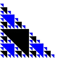
Currently, https://huggingface.co/stabilityai/sd-vae-ft-ema has the following in the visual section.
So far as I can see, the image in the middle seems to be the original one, while the two on each side seem to be reconstructed. This is especially obvious from the text reconstruction in the first and the last image, e.g. "SKATEBOARDS", "IN THIS AREA", "GLADYS", facial features/details e.g., eyes mouth in the rest of the figures. I therefore wondered, if the images at https://huggingface.co/stabilityai/sd-vae-ft-ema are incorrectly titled? I figured I'd let you know so that you can title it correctly, and better our understanding as a user the performance comparison betwen the EMA vs MSE variants.
256x256: ft-EMA (left), ft-MSE (middle), original (right)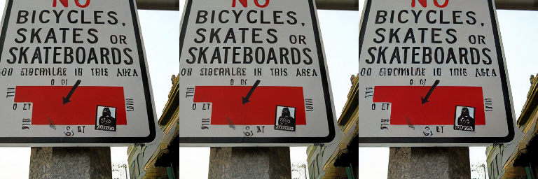
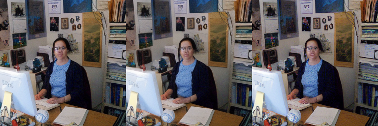
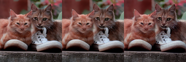
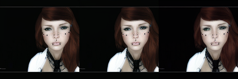
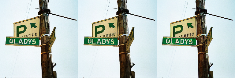
Ok, if I understand correctly, the one on the right is NOT an 'original image' per se (as in, NOT a real-life photograph), but rather a reconstructed/AI-generated one as 'generated by @StableDiffusion' as per your twett here: https://x.com/StabilityAI/status/1586183361361428480. That perhaps explains the quirkiness (the image somehow looks artificial even for the ones I thought to be 'original'/cleaner ones), i.e. those in the middle.
What I don't understand then are the following statements: "The first, ft-EMA, was resumed from the original checkpoint, trained for 313198 steps and uses EMA weights. It uses the same loss configuration as the original checkpoint (L1 + LPIPS). The second, ft-MSE, was resumed from ft-EMA and uses EMA weights and was trained for another 280k steps using a different loss, with more emphasis on MSE reconstruction (MSE + 0.1 * LPIPS). It produces somewhat ``smoother'' outputs. The batch size for both versions was 192 (16 A100s, batch size 12 per GPU)." What is being reconstructed exactly? The image on the right? Then how come the middle image looks way better + also way different than the what was supposed to be reconstructed?