Spaces:
Running

A newer version of the Gradio SDK is available:
5.16.0
title: Gradio DualVision Demo
emoji: 👀
colorFrom: blue
colorTo: red
sdk: gradio
sdk_version: 4.44.1
app_file: app.py
pinned: true
license: cc-by-sa-4.0
This thing ☝️ is metadata required at the top of README.md for hosting this exact repository as a Hugging Face Space 🤗.
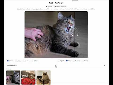
Gradio DualVision
DualVision is a Gradio template app for image processing. It was developed to support the Marigold project. The app features:
- A web interface, powered by Gradio and gradio-imageslider.
- Compatibility with desktop and mobile browsers.
- Native integration with Hugging Face Spaces.
- GPU support in the backend, including Hugging Face ZeroGPU.
- Easily upload input images, including from the camera roll.
- Easily add configurable settings and see their effect instantly.
- Instant processing and side-by-side inspection.
- Multi-modal prediction: as it often happens, your algorithm can produce multiple images.
- Radio-buttons for easy switch between the inputs and produced outputs.
- A built-in examples gallery for a smoother user experience.
Live demo
YouTube video:
This very space running live on Hugging Face Spaces:
A few real examples:
Quick start
Check out the template image processing app.py; copy it and start modifying!
- Install as a python package:
pip install git+https://github.com/toshas/gradio-dualvision.git. - Create an
app.pyfile. - Import and subclass from
DualVisionApp. - Implement
build_user_componentsandprocessmethods, and optionallymake_header. - Launch the app!
DualVisionApp API
title: Title of the application (str, required).examples_path: Base path where examples will be searched (Default:"examples").examples_per_page: How many examples to show at the bottom of the app (Default:12).examples_cache: Examples caching policy, corresponding tocache_examplesargument of gradio.Examples (Default:"lazy").squeeze_canvas: When True, the image is fit to the browser viewport. When False, the image is fit to width (Default:True).squeeze_viewport_height_pct: Percentage of the browser viewport height (Default:75).left_selector_visible: Whether controls for changing modalities in the left part of the slider are visible (Default:False).advanced_settings_can_be_half_width: Whether allow placing advanced settings dropdown in half-column space whenever possible (Default:True).key_original_image: Name of the key under which the input image is shown in the modality selectors (Default:"Original").spaces_zero_gpu_enabled: When True, the app wraps the processing function with the ZeroGPU decorator.spaces_zero_gpu_duration: Defines an integer duration in seconds passed into the ZeroGPU decorator.slider_position: Position of the slider between 0 and 1 (Default:0.5).slider_line_color: Color of the slider line (Default:"#FFF").slider_line_width: Width of the slider line (Default:"4px").slider_arrows_color: Color of the slider arrows (Default:"#FFF").slider_arrows_width: Width of the slider arrows (Default:2px).gallery_thumb_min_size: Min size of the gallery thumbnail (Default:96px).**kwargs: Any other arguments that Gradio Blocks class can take.
NB: when setting spaces_zero_gpu_enabled=True, it may be required to add import spaces at the top of the app.py to
avoid the RuntimeError with "CUDA has been initialized before importing the spaces package".
Real talk
Q: What is the idea behind this template?
A: Processing an image with various settings, inspecting multiple outputs side-by-side, and deploying such a demo with
readily-accessible examples is a common pattern in computer vision and image processing. This template extends upon
the gradio-imageslider custom component, adds modality selectors (radio
buttons), and connects it all nicely with the Gradio's built-in Examples functionality.
Q: Isn't it exactly what gradio-imageslider is doing?
A: Not quite. See the gradio_dualvision/gradio_patches directory for a complete set
of version-specific changes required to wire it all up nicely. Indeed, a custom component with all these functions
would be more efficient.
Q: What is the architecture of the template?
- Inputs: an input image (that is either uploaded or sent from Examples), and any settings you create in the
build_user_componentsoverride. - Outputs: a dictionary of
PIL.Images produced by yourprocessfunction override, subsets of which you want to inspect side-by-side in the Slider. - State: a hidden
gradio.Gallerycomponent that stores all the output modalities from yourprocessoverride. - Selectors:
gradio.Radiobuttons, which react to clicks and send requested images from the State to the Slider. - Slider:
gradio-imageslidercustom component that allows using the slider to reveal parts of the images. - Examples:
gradio.Examplescomponent that displays a gallery of example images, processes them upon the first click, and caches the result for next users.
Q: What are the conventions for build_user_components and process overrides?
build_user_componentsdefinesgradiocomponents and their layout, which will be visible in the "Advanced Settings" dropdown under the Slider component.- Each such component will have a default value; it is possible to either hardcode it, or use a class variable, as it
will be needed again in the
processfunction (for example, define it asself.DEFAULT_SETTING_VALUE). - Associate a string with each created setting (for example,
"setting_name") that you want to pass around and output a dictionary of them. processtakes an image and**kwargs, which may or may not contain the settings of interest.- To resolve a setting, use
kwargs.get("setting_name", self.DEFAULT_SETTING_VALUE)in order to fall back to the initial value of this setting. - This way, default settings will be applied only to Example images that did not have custom example settings.
Q: How do I specify custom default arguments for an example image?
A: Just create a file called <path_to_image>.settings.json and populate it with the custom settings for this sample -
they will take precedence over the global default settings.
Q: How do I modify the app header?
A: Override the make_header method and use gradio.HTML or gradio.Markdown to customize the header.
Q: What's up with the Example cats?
These are the cats of the Marigold authors!
Limitations
- Does not work correctly inside the
TabbedInterface. - Double copying between the hidden gallery component and the slider introduces visible flickering.
- Fixed versions of
gradio==4.44.1andgradio_imageslider==0.0.20; PRs are welcome but should start as a discussion in the Issues first.
Citation:
If you find this code useful, we kindly ask you to cite our papers:
@InProceedings{ke2023repurposing,
  title={Repurposing Diffusion-Based Image Generators for Monocular Depth Estimation},
  author={Bingxin Ke and Anton Obukhov and Shengyu Huang and Nando Metzger and Rodrigo Caye Daudt and Konrad Schindler},
  booktitle = {Proceedings of the IEEE/CVF Conference on Computer Vision and Pattern Recognition (CVPR)},
  year={2024}
}
License
Creative Commons Attribution-ShareAlike 4.0 International License